Preview image. Unlock full-res
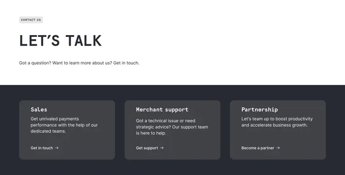
Split contact section with white Let's Talk header above dark three-card row for Sales, Merchant support, and Partnership text links.
Summary
Checkout.com contact header with light top band "Let's talk" and dark bottom row of three rounded cards routing to sales, merchant support, and partnerships.
Visual description
Two-band vertical layout. Top white section: small gray pill badge "Contact us," large dark headline "Let's talk," gray subline on questions and learning more. Bottom charcoal section: three equal dark gray rounded cards in a row. Each card has white monospaced-style title (Sales, Merchant support, Partnership), light gray description paragraph, and white text link with arrow (Get in touch, Get support, Become a partner). No filled buttons; links only. High contrast between white header and dark card row.
Key takeaway
Light intro band plus dark card deck cleanly separates emotional headline from routing options. Monospaced card titles add fintech/dev credibility without changing the minimal layout.
Reuse notes
Use for payments or infrastructure contact pages with distinct support paths. Text-link CTAs feel lighter than buttons; ensure tap targets on mobile. Dark cards need sufficient padding for long copy.
More contact sections
See all

More like this
Keep what you find
A free account saves references to boards and can send you a weekly email of picks based on what you save.
To see every result, go Pro.