Preview image. Unlock full-res
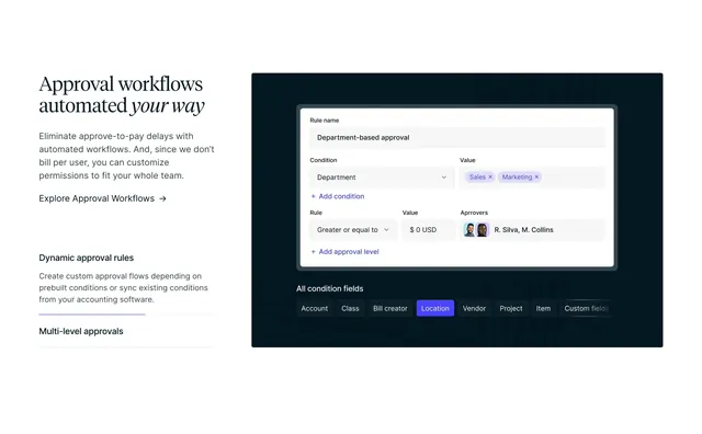
Light split feature with serif headline, tabbed benefit list, and a dark rule-builder UI mockup showing conditional approvals.
Summary
Light split feature with serif headline, tabbed benefit list, and a dark rule-builder UI mockup showing conditional approvals.
Visual description
White full-width section in a roughly 40/60 split. Left side carries a large serif headline Approval workflows automated your way with your way in italics, a sans body paragraph about eliminating approve-to-pay delays and unlimited team permissions, an Explore Approval Workflows arrow link, and a vertical tab list. Dynamic approval rules is active with a thin rule above and explanatory copy about custom flows synced from accounting software; Multi-level approvals sits below as an inactive item. Right side is a deep navy panel holding a white Rule Builder card: fields for rule name (Department-based approval), condition dropdowns (Department, Sales and Marketing tags), amount threshold ($0 USD), approver avatars (R. Silva, M. Collins), and blue add links. Below the card, a row of dark pill buttons labels condition fields (Account, Class, Bill creator, Location highlighted in purple, Vendor, Project, Item, Custom fields) fading off to the right.
Key takeaway
Contrasting a clean white copy column with a dark product panel makes complex workflow UI feel approachable. Tabbed sub-features under one headline let you explain depth without leaving the section. Highlighting one condition-field pill in brand purple draws the eye to configurability.
Reuse notes
Strong for B2B SaaS explaining rules engines, permissions, or automation builders. Needs a real UI capture or faithful mockup; the dark panel only works if the interface is legible. Tab list implies interaction that must exist on the live page.
More feature detail sections
See all



More like this





Keep what you find
A free account saves references to boards and can send you a weekly email of picks based on what you save.
To see every result, go Pro.