Preview image. Unlock full-res
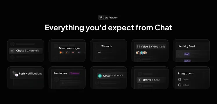
Dark ten-tile grid listing chat essentials from channels and DMs to threads, calls, notifications, and Zapier/GitHub integrations.
Summary
Core features badge above a 5x2 dark card grid enumerating standard chat capabilities with miniature UI hints per tile.
Visual description
Black page with centered Core features pill and headline Everything you'd expect from Chat. Ten dark rounded cards in two rows of five: Chats and Channels sidebar highlight; Direct messages with reaction emoji counts; Threads with reply connector; Voice and Video Calls with avatar cluster; Activity feed with @mention pills; Push Notifications floating bubble; Reminders with clock bar; Custom sidebar with globe icon; Drafts and Sent with paper plane; Integrations listing Zapier and GitHub logos.
Key takeaway
Uniform small tiles with one micro-UI each communicate parity with incumbent chat tools without screenshots per feature. Dark glass cards keep a dense grid readable.
Reuse notes
Use when launching chat inside a broader platform and needing checklist credibility. Ten tiles may need responsive reflow on mobile.