Preview image. Unlock full-res
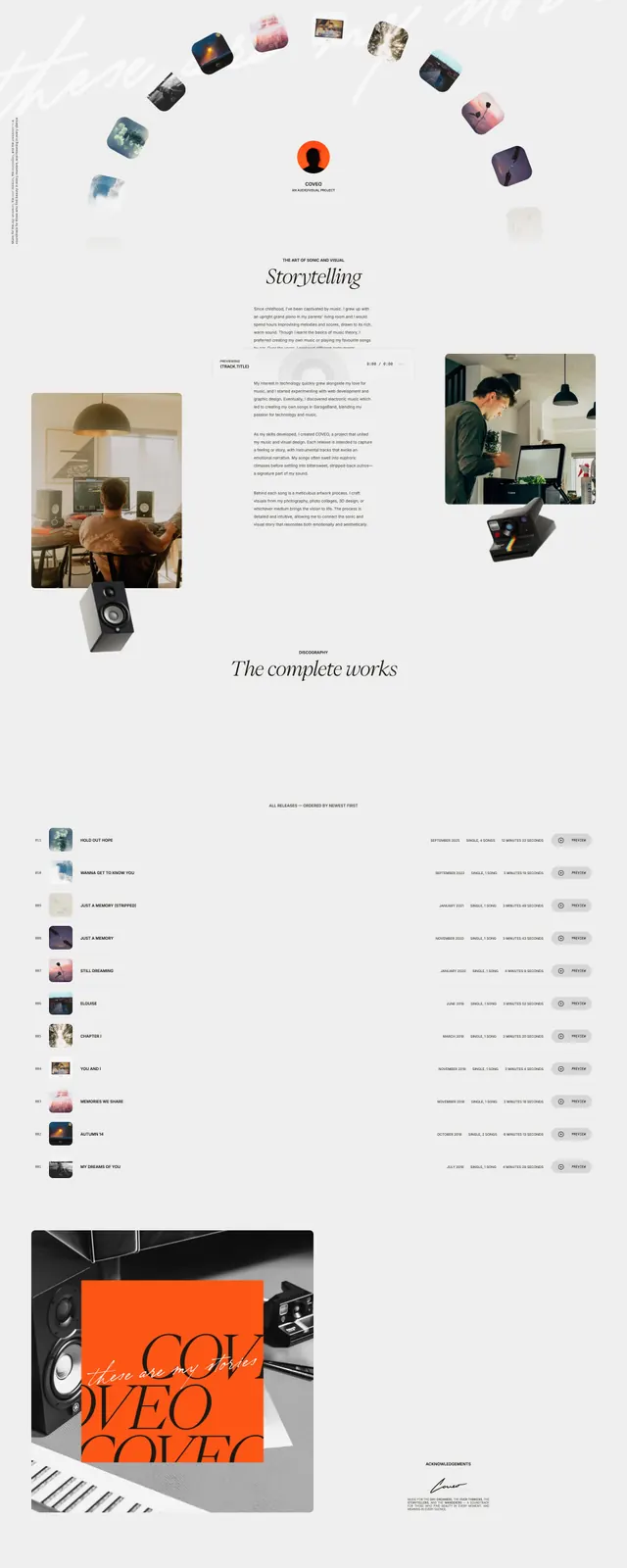
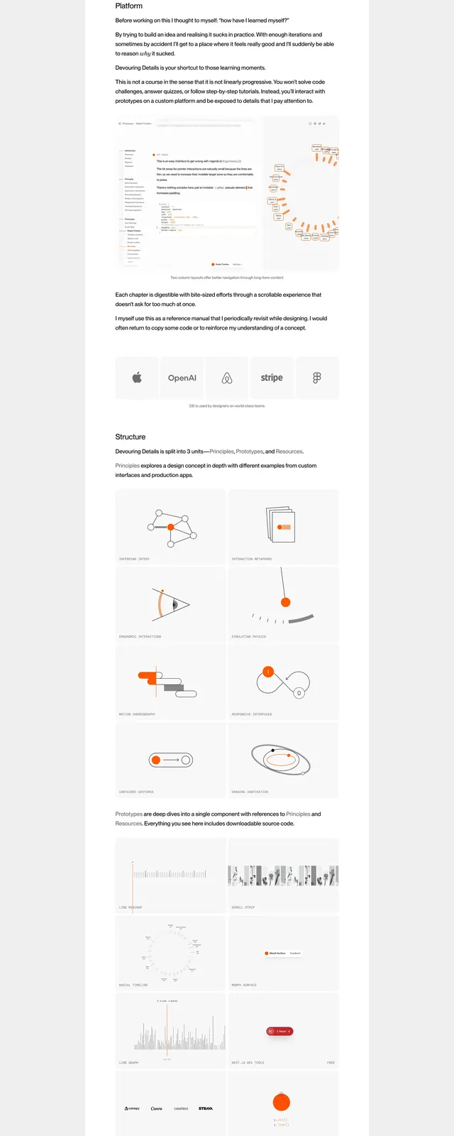
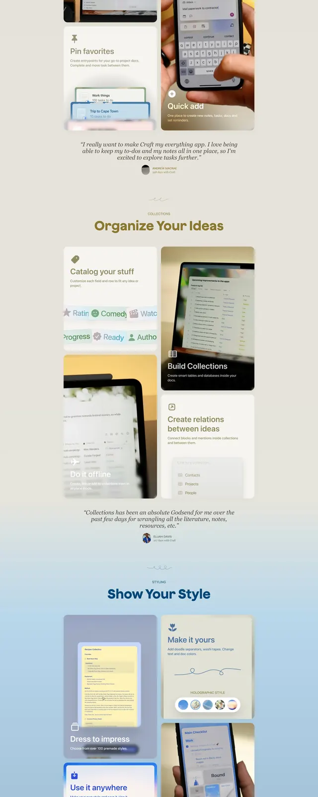
A soft, magazine-like SaaS landing page with warm neutral tones, oversized headlines, and stacked product showcase sections.
Summary
A soft, magazine-like SaaS landing page with warm neutral tones, oversized headlines, and stacked product showcase sections.
Visual description
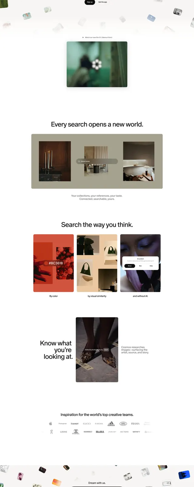
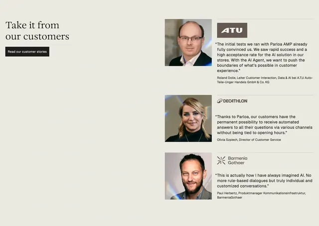
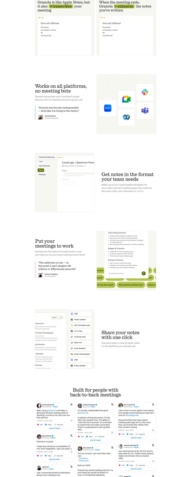
The page uses a centered hero with a small logo, a large two-line headline, and a dark pill CTA above a framed video preview. Below, the layout shifts into a bento-style grid of feature cards with rounded corners, soft shadows, and embedded product imagery. Further down there are testimonial quotes and a second CTA section, all on a warm beige-to-pastel gradient background. The overall composition feels airy and editorial, with generous spacing and muted contrast.
Key takeaway
This design combines a calm, premium color palette with a structured bento layout to make a productivity app feel polished and approachable. The strongest reusable pattern is the centered hero followed by a card-based feature grid.
Reuse notes
Reuse the oversized centered headline, pill CTA, and framed media preview for a clean SaaS hero. The bento feature grid and testimonial band are also adaptable for product landing pages that need a soft editorial tone.