Preview image. Unlock full-res
A clean, editorial landing page for a design reference product with a centered white canvas, orange accents, and a long FAQ-heavy sales structure.
Summary
A clean, editorial landing page for a design reference product with a centered white canvas, orange accents, and a long FAQ-heavy sales structure.
Visual description
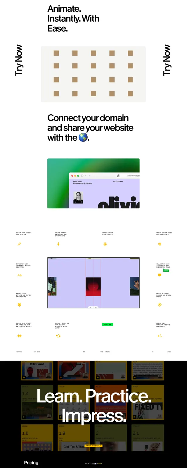
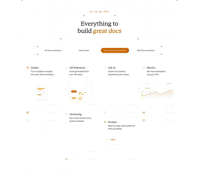
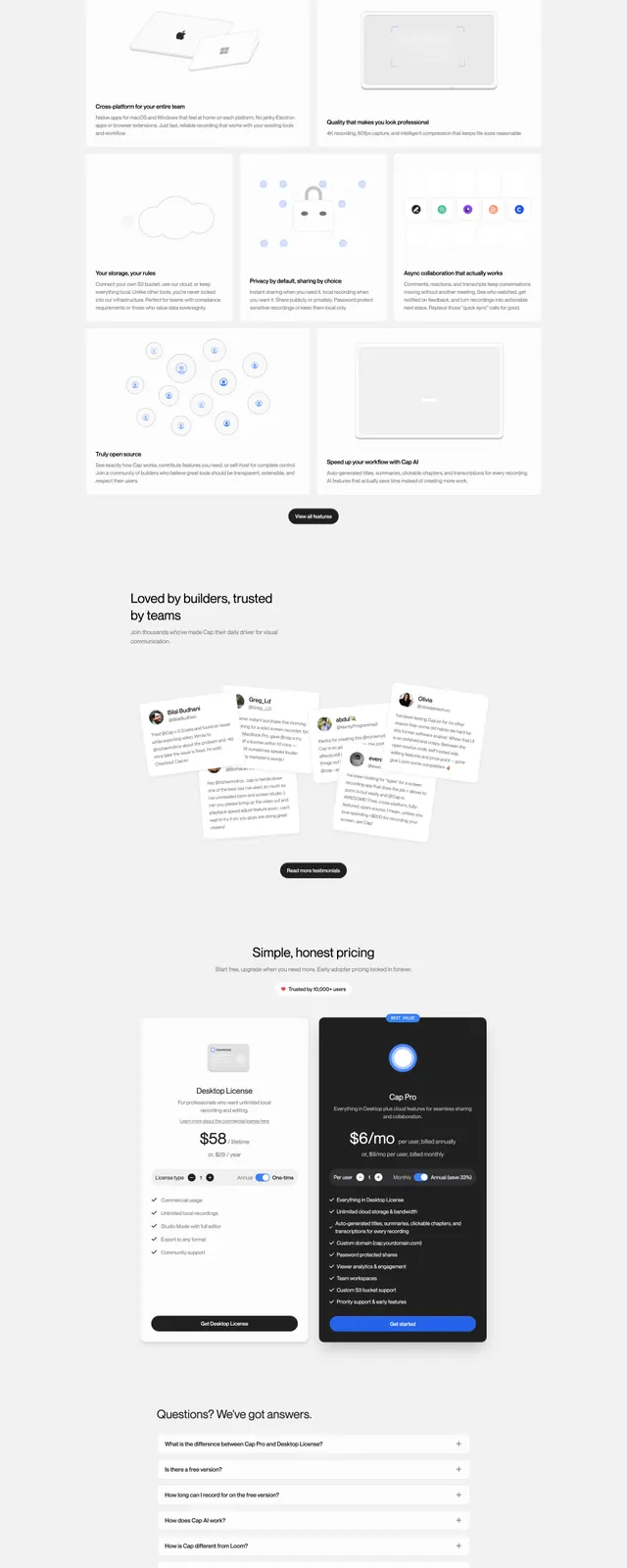
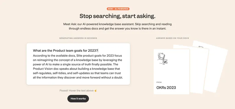
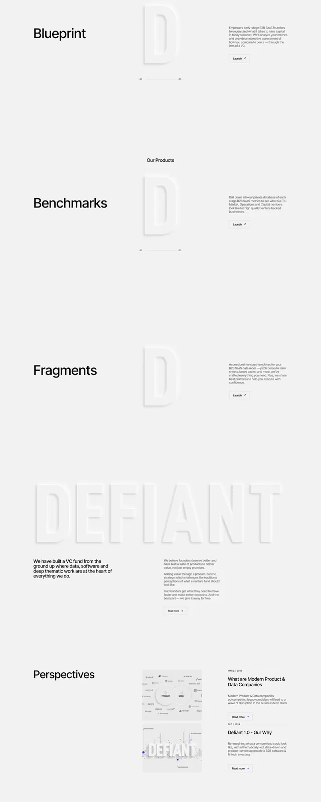
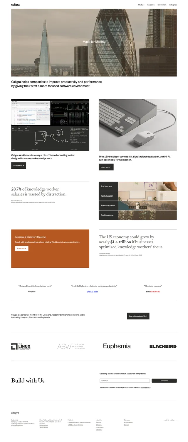
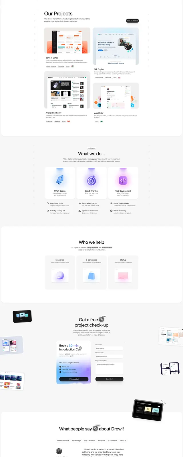
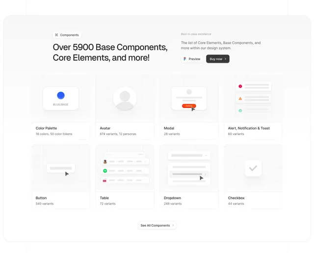
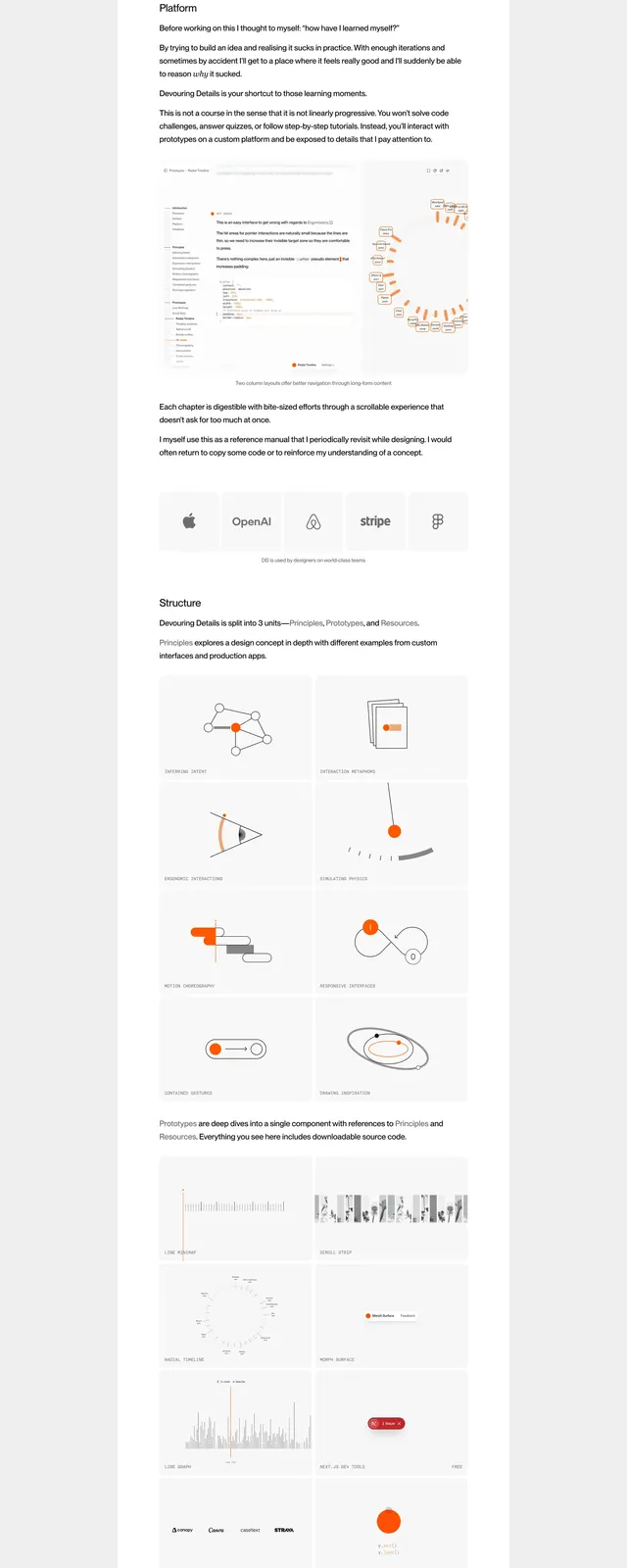
The page sits on a light gray background with a centered white content column, creating a boxed editorial feel. The top area includes a simple navigation list, a small orange accent, and a compact orange CTA at the right edge, followed by a two-column intro with text on the left and right. Farther down, the page shows a large embedded video preview, a row of brand logos, a two-column structure section with multiple illustration cards, an orange register button with crossed-out and current pricing, and a long FAQ list with accordion rows. The overall palette stays mostly white, gray, black, and orange, with thin dividers and generous spacing throughout.
Key takeaway
The strongest reusable idea is the restrained, centered sales-page layout with one vivid accent color used only for emphasis. The combination of editorial spacing, product proof, logos, and accordion FAQ makes the page feel both polished and information-rich.
Reuse notes
Use this pattern for premium educational products, design resources, or creator-led offerings where trust and clarity matter more than visual noise. It works best when you have strong content blocks to break up a long page: intro copy, media preview, social proof, feature structure, pricing, and FAQs.