Preview image. Unlock full-res
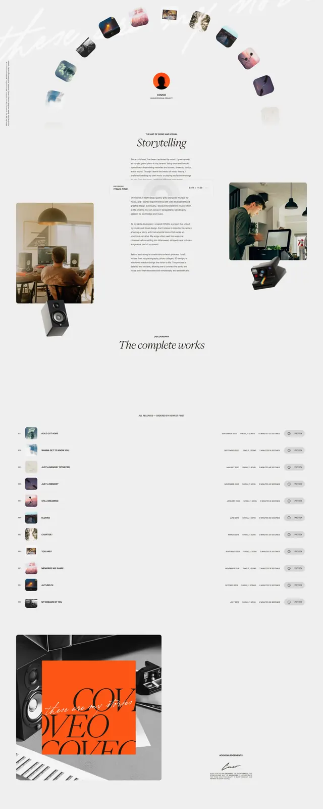
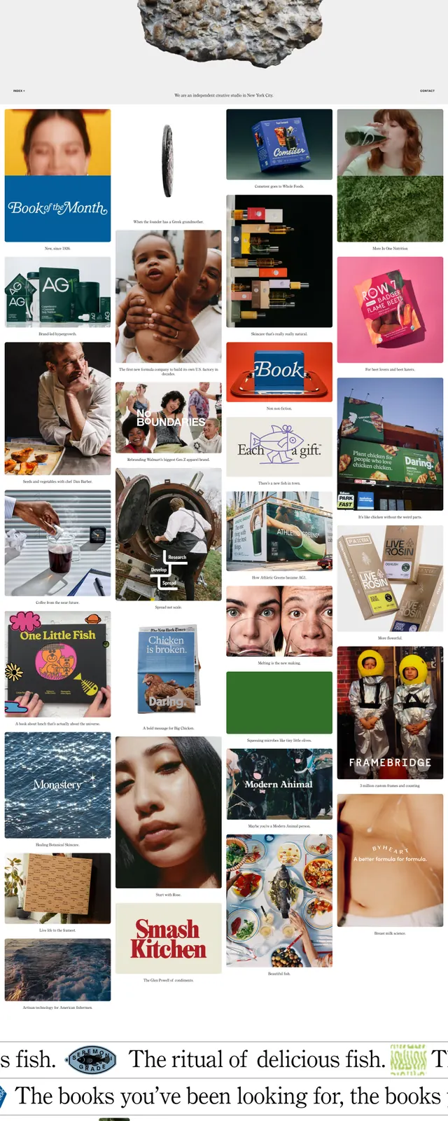
A light, editorial portfolio homepage built around a centered hero image and a dense masonry of project thumbnails and typographic strips.
Summary
A light, editorial portfolio homepage built around a centered hero image and a dense masonry of project thumbnails and typographic strips.
Visual description
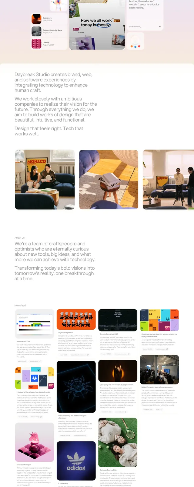
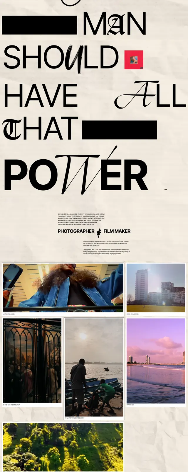
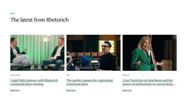
The page opens on a sparse hero with a centered title, tiny corner navigation, and a large cutout photo of a rough rock on a pale gray background. Below it is a tight masonry-style gallery of many project tiles mixing photography, packaging, posters, and branded graphics, each with small captions and wide spacing. Farther down, oversized serif text lines run horizontally across the page like a ticker, interrupted by small logos and image snippets. A minimal footer closes the page with compact contact and studio details.
Key takeaway
The strongest move is the contrast between a restrained, airy header and a busy, magazine-like project wall beneath it. The repeated mix of large serif typography and small-scale captions gives the page a distinctive editorial rhythm.
Reuse notes
Useful for creative studios, portfolio sites, and art-directed brand archives that need to feel curated rather than commercial. It works best when the site has strong imagery and when the goal is to showcase breadth without relying on heavy UI chrome.