Preview image. Unlock full-res
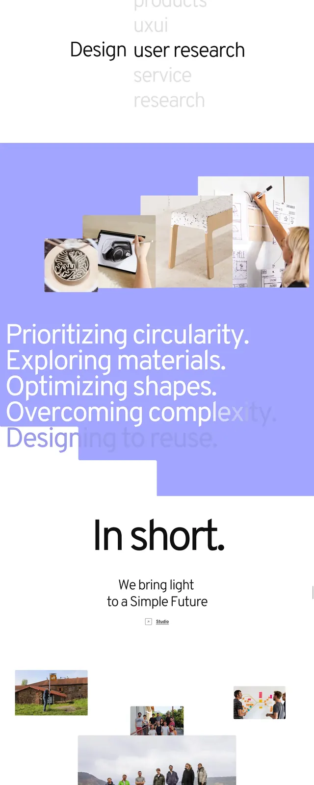
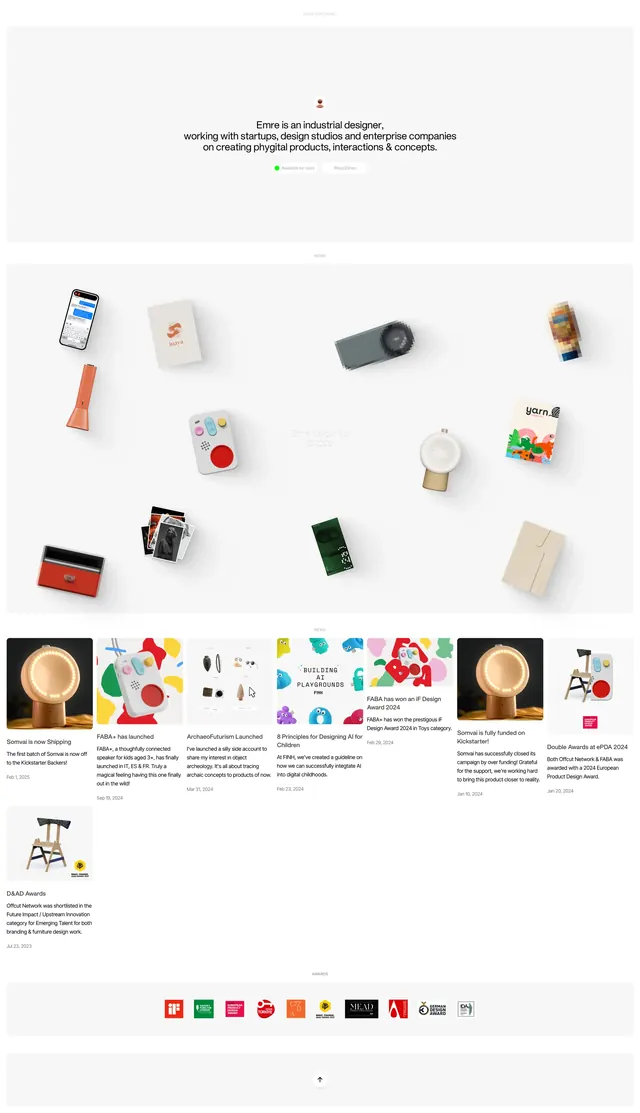
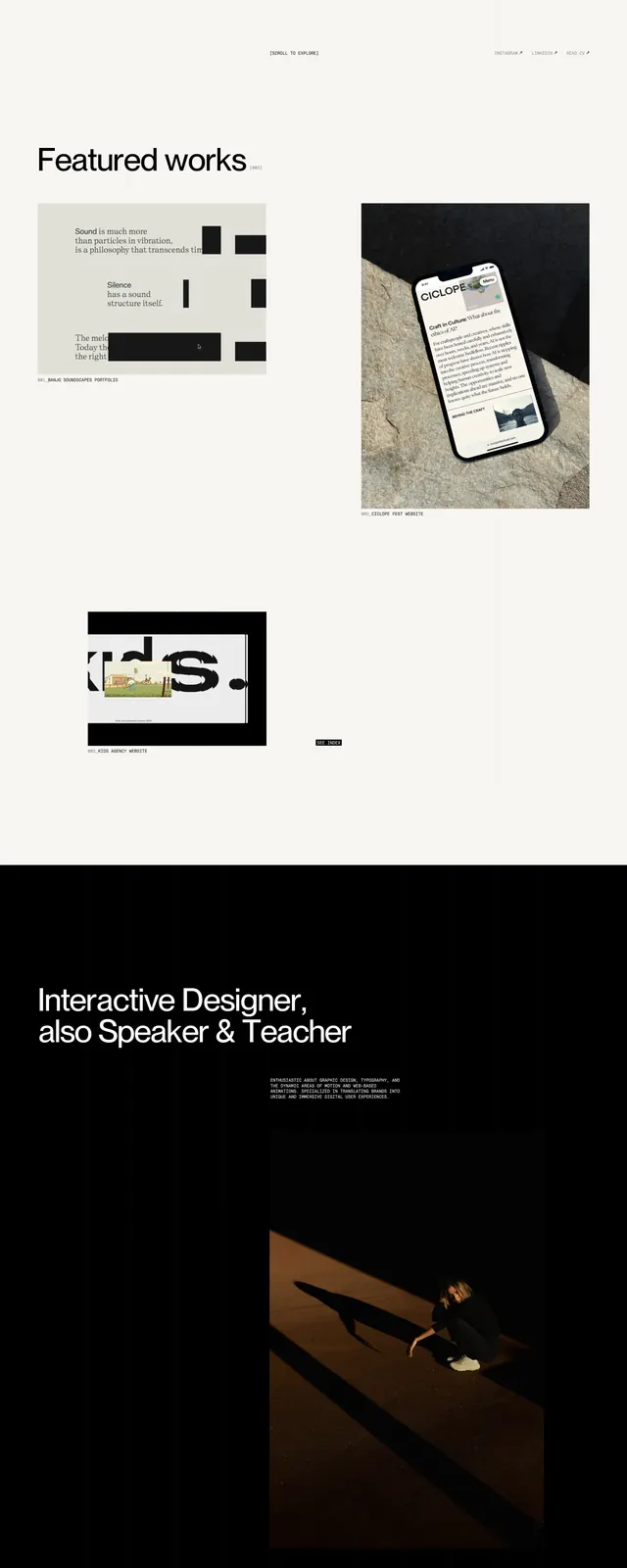
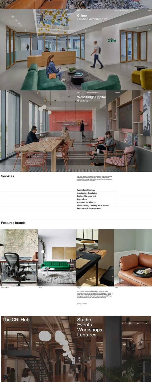
A bold agency landing page that mixes oversized editorial typography with colorful, image-led storytelling and sparse white-space sections.
Summary
A bold agency landing page that mixes oversized editorial typography with colorful, image-led storytelling and sparse white-space sections.
Visual description
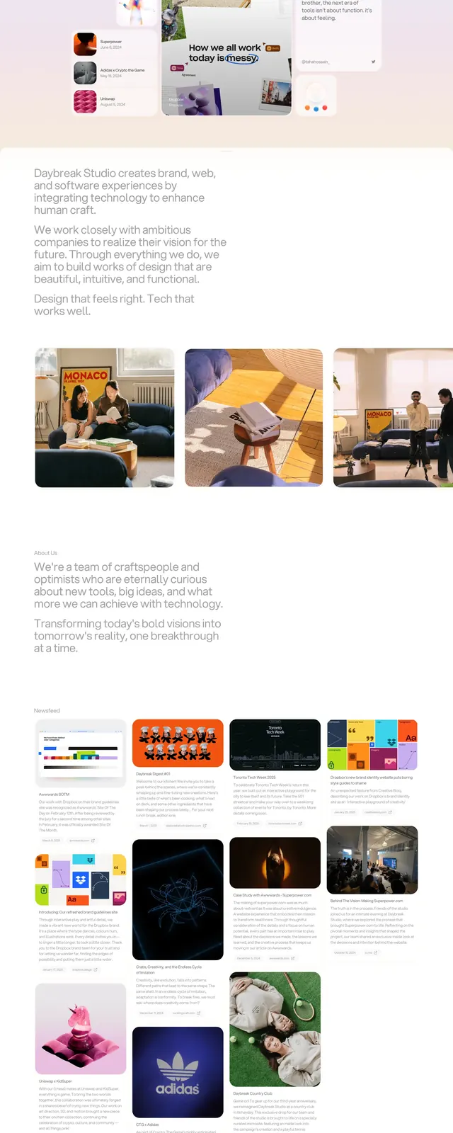
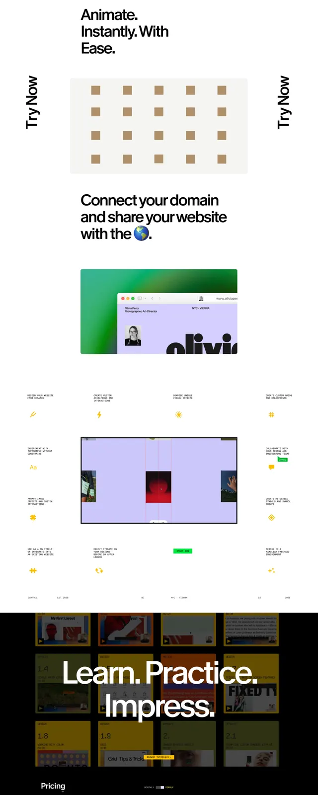
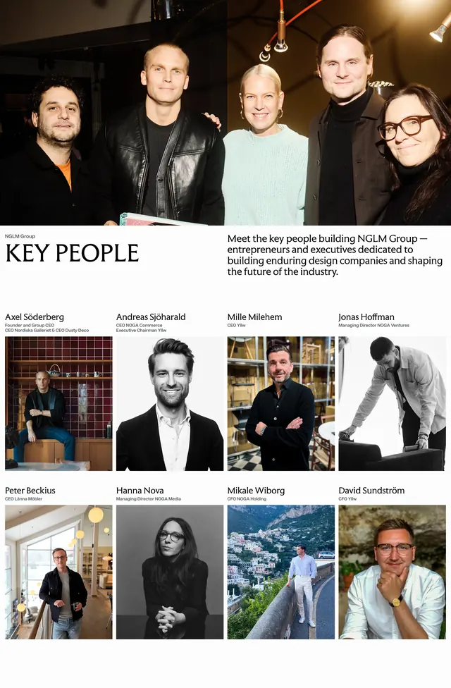
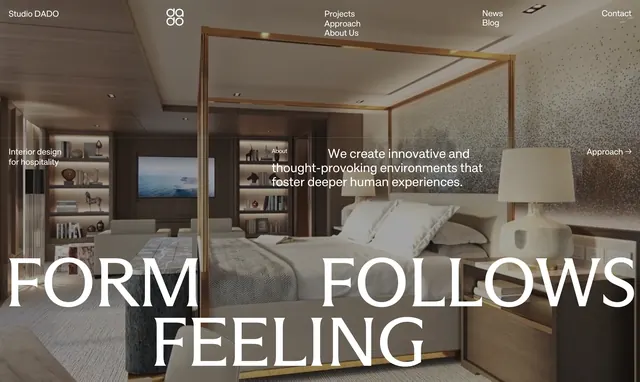
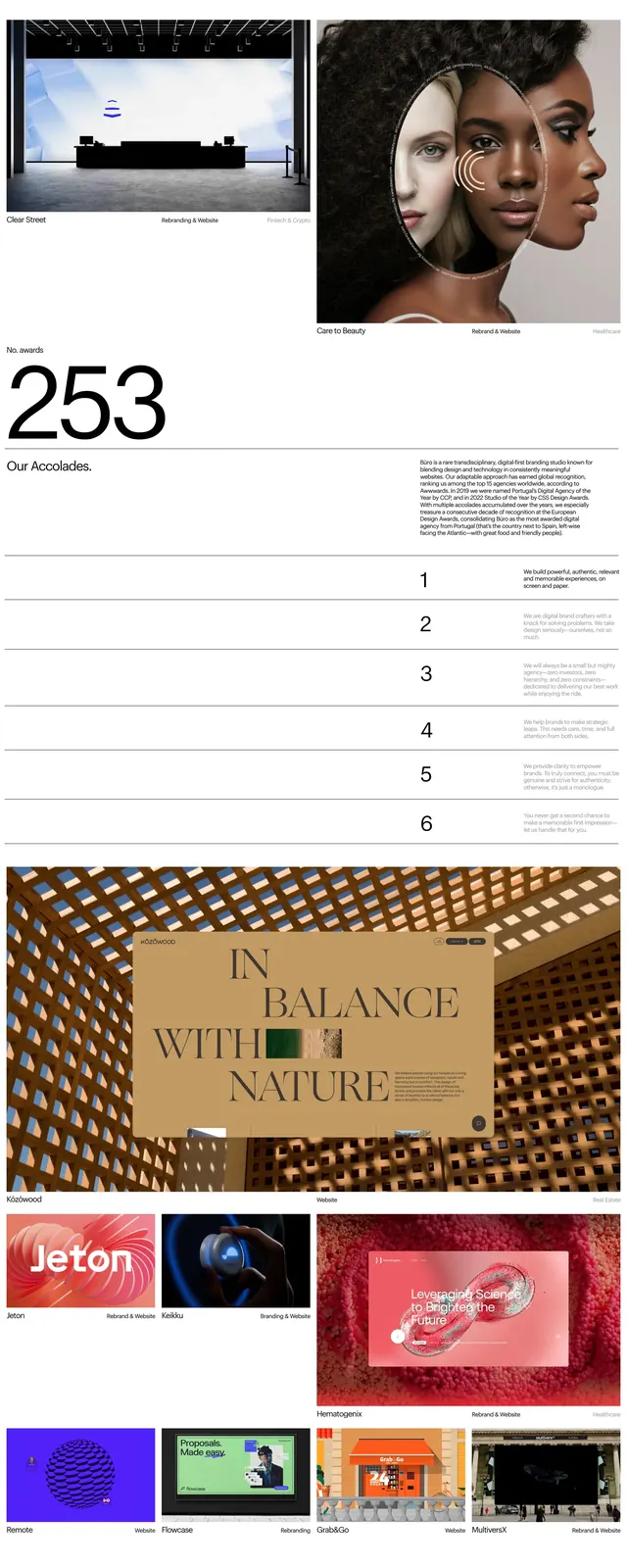
The page opens with a full-width hero image of a brightly colored mural-style composition, paired with a minimal pill-shaped control bar near the bottom of the image. Below it, a large centered headline uses oversized black sans-serif type with playful icon accents and generous white space. The page continues with thin horizontal dividers, small editorial copy, numbered list items, and a testimonial section laid out in wide columns. A later slice shows another full-bleed image with a centered beige content block, reinforcing the art-directed, magazine-like feel.
Key takeaway
This design relies on strong typographic hierarchy, deliberate whitespace, and vivid image panels to create a premium agency presence. The reusable pattern is a minimal editorial framework wrapped around bold visual storytelling.
Reuse notes
Use this approach for studios or portfolios that want to feel curated and confident without heavy UI chrome. The strongest reusable elements are the oversized headline, thin divider structure, and image-driven section transitions.