Preview image. Unlock full-res
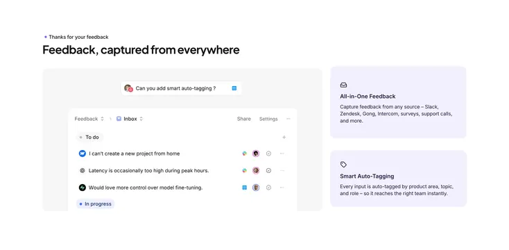
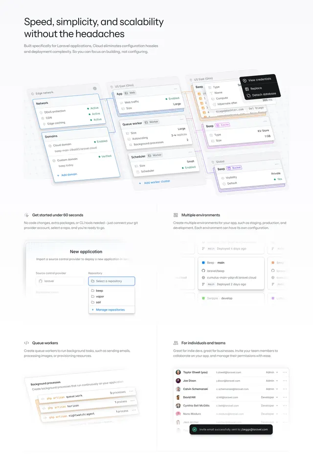
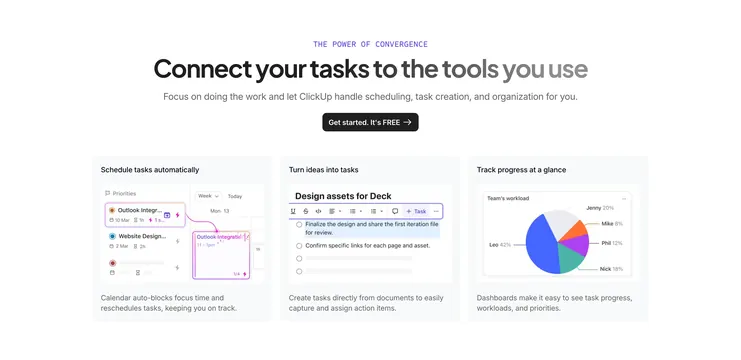
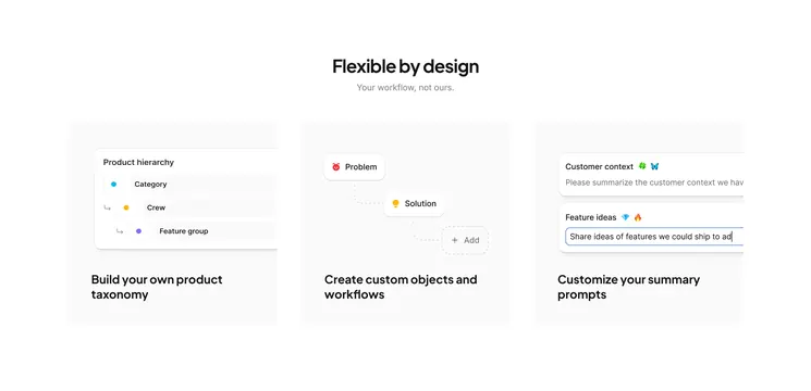
Three-column feature grid on white showing customizable product taxonomy, workflows, and summary prompts with UI mockups inside rounded cards.
Summary
A centered headline pair leads into three equal cards, each pairing a miniature product UI with a short benefit line about flexible workflow configuration.
Visual description
White background with black headline "Flexible by design" and grey subhead "Your workflow, not ours." Three light grey rounded cards sit in a row. The first shows a nested product hierarchy list with colored dot icons. The second shows a dotted flow from Problem to Solution to an Add node. The third shows prompt configuration fields for customer context and feature ideas with emoji labels. Bold black captions sit below each card illustration.
Key takeaway
Using live UI snippets inside cards instead of abstract icons makes abstract configurability feel tangible. The dotted workflow path and hierarchy tree communicate customization without long copy.
Reuse notes
Strong pattern for product-led SaaS explaining flexibility. Works when each card can show a distinct mini-interface. Needs enough horizontal space for three columns; stack on mobile.