Preview image. Unlock full-res
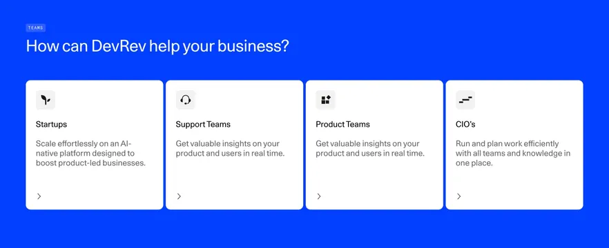
Bold cobalt-blue features section with a white headline and four white audience cards, each with a small icon, title, short copy, and a chevron link.
Summary
A high-saturation cobalt-blue features section presenting four equal white cards, each segmented by audience (Startups, Support Teams, Product Teams, CIO's), with a small icon, title, short copy, and a chevron link. The flat blue field behind crisp white cards is what makes it pop.
Visual description
A solid bright cobalt-blue background fills the section. Top left, a small "TEAMS" pill label sits above a large white headline ("How can DevRev help your business?"). Below, four equal white rounded cards run in a single row. Each card has a light-grey rounded icon tile at the top left holding a simple black glyph, then a black title (Startups, Support Teams, Product Teams, CIO's), two or three lines of grey body copy, and a small black chevron arrow in the lower left signaling a link. The cards share equal height with generous internal padding.
Key takeaway
A single saturated brand color as a full-bleed background makes plain white cards feel energetic and on-brand with zero extra decoration. Segmenting features by audience persona rather than by feature lets visitors self-select, and the consistent icon-tile plus chevron pattern keeps four cards perfectly uniform.
Reuse notes
Great for a "who it's for" or solutions-by-persona block when you have a strong brand color to commit to. The intensity depends on that color being genuinely vivid; a muted background would make it look flat. Easy to extend or shrink the card count. Works in light mode and reads well against neighboring white sections.