Preview image. Unlock full-res
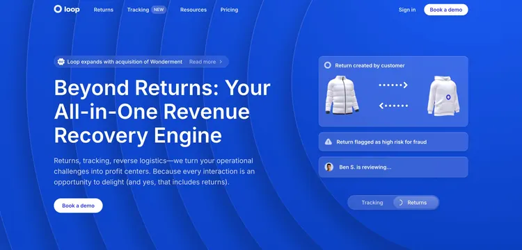
Two-column ecommerce-returns hero on a deep blue field, with an oversized left headline and a right stack of live return-status cards.
Summary
A bold two-column hero on saturated blue: an oversized left headline and a single CTA paired with a right column of stacked, abstracted return-status cards that stand in for the product UI.
Visual description
A deep blue background with faint concentric arc lines. The navbar holds the white "loop" logo left, Returns / Tracking (with a "NEW" pill) / Resources / Pricing center, and "Sign in" plus a white "Book a demo" button right. Left column: a rounded announcement pill "Loop expands with acquisition of Wonderment - Read more", a huge white three-line headline "Beyond Returns: Your All-in-One Revenue Recovery Engine", a three-line lighter-blue subhead, and a single white "Book a demo" button. Right column: a large card "Return created by customer" showing two garment photos with dotted exchange arrows between them, then two slim status cards "Return flagged as high risk for fraud" and "Ben S. is reviewing..." with an avatar, and a Tracking/Returns segmented toggle at the bottom.
Key takeaway
Using stacked, plain-language status cards ("Return created", "flagged as high risk", "is reviewing") instead of a literal dashboard screenshot tells the product's story as a sequence of moments. The monochrome blue field lets white type and white cards carry all the contrast.
Reuse notes
A strong hero for an ecommerce-ops or returns SaaS that wants to feel bold and branded rather than screenshot-heavy. The abstracted card stack is reusable whenever the real UI is too dense for a hero. Commit fully to one saturated brand color for this to work; it leaves little room for a second accent.