Preview image. Unlock full-res
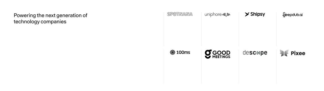
Minimal light logo section pairing a short left-aligned heading with a two-row grid of greyscale customer logos.
Summary
A clean light logo section where a two-line heading sits alone on the left and eight greyscale company logos fill a four-column, two-row grid on the right.
Visual description
Pure white background. The heading "Powering the next generation of technology companies" is set small in dark sans-serif, left-aligned in the upper-left quadrant, leaving the left half mostly empty. The right two-thirds holds a 4x2 grid of monochrome logos (Spotnana, Uniphore, Shipsy, Deepdub.ai across the top; 100ms, Good Meetings, Descope, Pixee below), each cell separated by very faint vertical hairlines. Logos are rendered black or dark grey with generous whitespace around each. No buttons or other UI.
Key takeaway
Splitting the heading off to one side rather than centering it above the logos, so the type and the logo grid read as two calm columns. The thin cell dividers give the grid quiet structure without boxes or fills.
Reuse notes
Good for a B2B or SaaS social-proof band where logos must read as the focus and the brand wants restraint. Works best on a fully white background with logos normalized to a single dark tone. The large empty left area needs the surrounding page rhythm to justify it.