Preview image. Unlock full-res
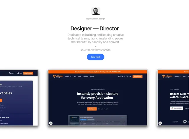
Centered minimal portfolio hero with a small avatar, a bold title, a short statement, one blue pill CTA and cropped framed screenshots below.
More like this
See all
Summary
A centered, minimal portfolio hero: a small avatar, a bold title, a short gray statement, one blue pill CTA, and cropped framed screenshots of work below.
Visual description
White background with a centered stack from top to bottom. A small rounded-square avatar of a smiling person in a grayscale illustration sits at the top, followed by a small gray email address. A large bold sans title reads Designer and Director on one line. Beneath it, a three-line gray sans statement is set in a light weight. Between the statement and the button sit a small asterisk glyph and an uppercase gray line listing example employers. The call to action is a solid blue pill with white lowercase text reading "let's work". Below the fold line, three browser-style framed screenshots of a dark navy product landing page sit in a row. The center frame is fully visible and the side frames are cropped at the edges. The orange accents in the screenshots are the only saturated color on the page.
Key takeaway
- Portfolio credibility comes from shipped work: the framed screenshots make the proof, and the text stays short.
- One saturated CTA on a neutral page keeps focus on the button.
- Centered stacking with a small avatar makes a personal landing page feel warm without decoration.
Reuse notes
Good for freelance and individual designer portfolios, and for leadership or consulting pages that want to show work. Relies on high-quality screenshots of real projects. The cropped frame row implies a scroll, so it only works as a carousel if the page makes it one.