Preview image. Unlock full-res
A minimal, oversized landing page for Bykins with heavy condensed typography, lots of whitespace, and soft pastel accent sections.
Summary
A minimal, oversized landing page for Bykins with heavy condensed typography, lots of whitespace, and soft pastel accent sections.
Visual description
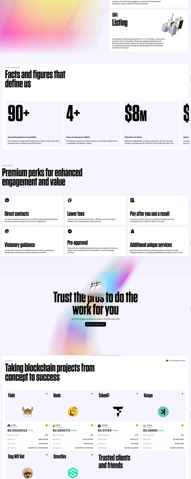
The page opens with a centered hero featuring a huge condensed headline on a white background, with a small top navigation and a compact call-to-action button. Below it is a centered intro block, followed by a mint-green logos strip with multiple client marks arranged in a grid. Further down, a rounded pink testimonial card overlaps the page above a wide photographic figure crop, and the bottom ends with an oversized gradient wordmark-style footer composition.
Key takeaway
The design relies on extreme typography scale, generous whitespace, and a few soft gradient color blocks to create a premium agency feel. The oversized footer treatment and simple navigation make the page feel bold without becoming visually noisy.
Reuse notes
Reuse the centered hero structure when you want the headline to carry the page and keep supporting copy minimal. The logos band and floating testimonial card are strong reusable patterns for credibility sections on agency or portfolio sites.