Preview image. Unlock full-res
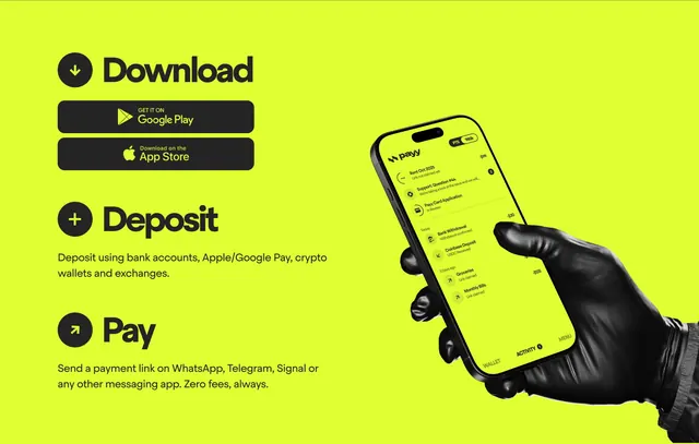
Full-bleed neon-lime section with three onboarding steps and app-store buttons on the left, gloved hand holding the Payy app on the right.
Summary
A high-contrast lime CTA that converts through a three-step Download-Deposit-Pay flow with store badges, anchored by a stylized hand-and-phone product shot.
Visual description
Solid bright lime-green background fills the frame. Left column stacks three steps with generous vertical rhythm. Each step opens with a black circle icon (down arrow, plus, outbound arrow), a large bold black heading (Download, Deposit, Pay), and supporting copy in regular weight black sans-serif. Download includes two black rounded app-store badges for Google Play and App Store. Deposit and Pay use short benefit lines about funding sources and zero-fee messaging-app payments. Right column shows a black-gloved hand entering from the bottom holding a tilted phone. The on-screen Payy app mirrors the lime palette: logo top-left, PTS 980k pill top-right, activity feed with rent, support, card-application, and transaction rows, and a bottom nav of WALLET, ACTIVITY, MENU. No separate headline above the steps; the steps themselves carry the narrative.
Key takeaway
Numbered lifecycle steps plus live app UI in one section removes guesswork for new users. Black-on-lime and a gloved hand give a fashion-forward fintech tone without abandoning clarity.
Reuse notes
Works as a mid-page or pre-footer CTA for mobile-first payment apps. Store badges must be official assets for compliance. The glove prop is distinctive but polarizing; swap for a bare hand if targeting mainstream banking. Needs ample horizontal space for the phone crop.