Preview image. Unlock full-res
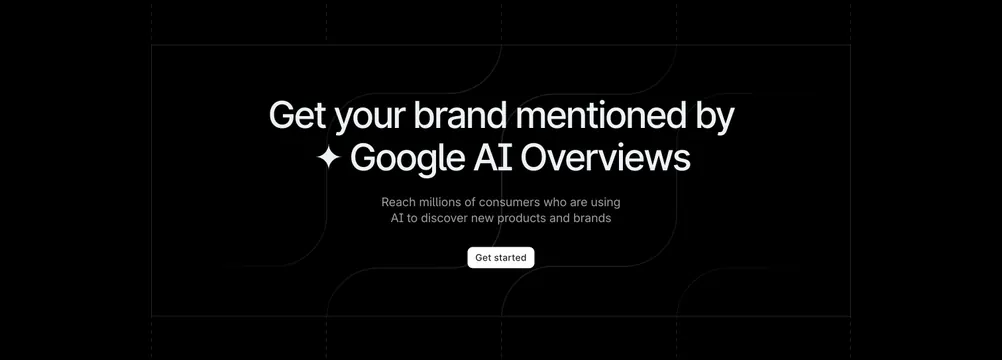
Minimal dark CTA centering an oversized headline, one line of muted copy, and a white-plus-ghost button pair over a faint blueprint grid.
Summary
A stripped-back dark CTA: an oversized three-line headline, a single line of sub-copy, and a white primary button beside a ghost secondary, all centered over a barely-visible grid.
Visual description
On a near-black background a faint blueprint-style grid is just visible behind the content. A large white three-line headline ("Experience a modern approach to contract management") is centered, followed by two centered lines of muted grey sub-copy. Beneath sit two pill buttons: a white filled Sign up button with a dark arrow, and a dark outlined Learn more ghost button with a subtle border. There is no imagery; the layout is pure type and buttons with heavy surrounding space.
Key takeaway
The almost-invisible grid adds just enough texture to keep a type-only dark CTA from feeling empty, without competing with the headline. A solid white button next to a near-invisible ghost button keeps a single obvious primary action.
Reuse notes
A versatile closing CTA for any dark B2B or SaaS page; it carries no brand-specific imagery, so it ports easily. The faint grid only reads on a truly dark background. Keep the headline short since type is the whole composition.