Preview image. Unlock full-res
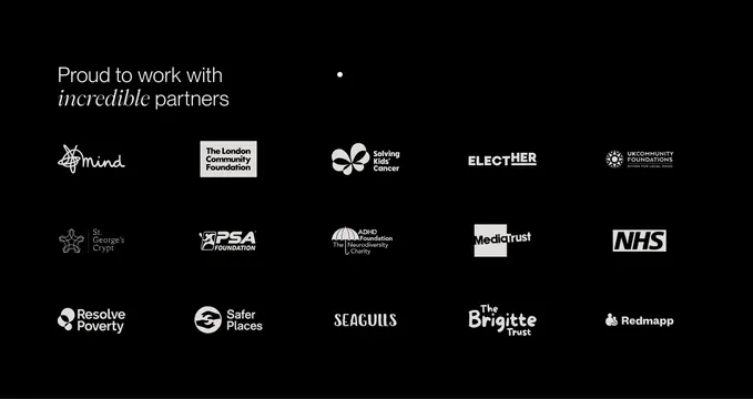
Dark partner logo grid with top-left headline mixing sans-serif copy and italic serif emphasis, all marks in white on black.
Summary
A black about-page partner section with a top-left mixed-type headline and a three-by-five grid of charity and nonprofit logos normalized to white.
Visual description
Solid black background with content anchored top-left. Headline reads "Proud to work with incredible partners" in white sans-serif, with "incredible" set in italic serif for contrast. Below, fifteen partner logos fill a three-row grid of five columns. Visible marks include Mind, The London Community Foundation, Solving Kids' Cancer, ELECTHER, UK Community Foundations, St. George's Crypt, PSA Foundation, ADHD Foundation, Media Trust, NHS, Resolve Poverty, Safer Places, SEAGULLS, The Brigitte Trust, and Redmapp. Every logo is rendered monochrome white at roughly equal visual weight with consistent row and column spacing.
Key takeaway
Italic serif emphasis inside an otherwise sans headline adds editorial warmth without a second color. Forcing all partner marks to white on black creates a dignified, equal grid even when source brands are colorful.
Reuse notes
Strong for agency about pages serving charities, foundations, or public-sector clients. Requires enough recognizable logos to fill the grid; sparse sets will feel empty. Monochrome treatment may need SVG variants for complex marks.