Preview image. Unlock full-res
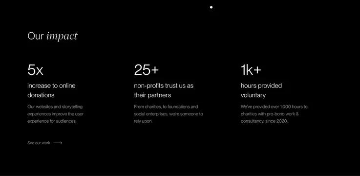
Black stats band with mixed-type "Our impact" heading and three large metrics on donations, nonprofit partners, and pro-bono hours.
Summary
A minimalist impact section on pure black that leads with editorial type and three oversized statistics, each with a short proof line.
Visual description
Full-width black field with a small white scroll dot centered at the top. Top left: mixed-type section label "Our impact" with sans "Our" and italic serif "impact". Below, three equal columns. Column one: oversized "5x", subheading "increase to online donations", gray body on improved UX for audiences, and a bottom "See our work" text link with right arrow. Column two: "25+" with "non-profits trust us as their partners" and copy on charities, foundations, and social enterprises. Column three: "1k+" with "hours provided voluntary" and copy on pro-bono work since 2020. All stats in bold sans at large scale; supporting text in smaller regular weight with generous vertical rhythm between columns.
Key takeaway
Mixed serif italics on the section title match the hero and footer voice while keeping numbers in clean sans for credibility. Three metrics with parallel structure (number, label, proof) scan fast without icons or charts. A single quiet portfolio link under the first stat avoids a loud CTA row.
Reuse notes
Best for agencies or nonprofits with quantifiable social proof. Numbers must be defensible; empty columns look harsh on black. No animation or counters visible in this still. Pairs well with the dark CTA and footer sections from the same site system.