Preview image. Unlock full-res
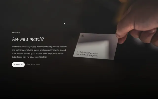
Dark split CTA pairing a serif "Are we a match?" headline with a hand-held mission card photo and dual contact actions.
Summary
A moody contact CTA that frames partnership as a mutual fit check, with editorial type on the left and a tactile hand-and-card photo on the right.
Visual description
Near-black field with soft vignette lighting. Left column: small caps "CONTACT US" label, large mixed-type headline "Are we a match?" with italic serif on the second word, a short paragraph about booking a call to confirm fit, then a white pill "Contact us" button beside a white "Book a Call" text link with a thin right arrow. Right column: close-up of a hand holding a small white card punched with a corner hole; the card repeats the agency mission line in dark serif with "better" italicized. High contrast white-on-black type against warm skin tones and the bright card.
Key takeaway
The "match?" framing turns a generic contact block into a qualification moment without feeling salesy. Repeating the mission on a physical card in the photo ties brand voice to a human gesture. Primary pill plus quiet arrow link gives two commitment levels in one row.
Reuse notes
Strong for agencies, consultancies, or nonprofits that want a relational tone before conversion. Needs a strong lifestyle or detail photo; the layout collapses to stacked on mobile. Works only on dark backgrounds with enough contrast for white type and buttons.