Preview image. Unlock full-res
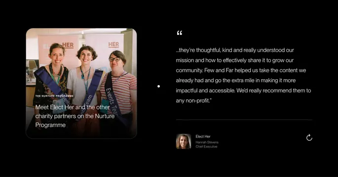
Dark split-layout testimonial with a rounded photo card and program caption on the left and a large quote with author block on the right.
Summary
A two-column testimonial block pairing a large rounded photo card with program context on the left against an oversized client quote and author details on the right, all on black.
Visual description
Left column: a square-ish photo with generous corner radius showing three women in event sashes at an Elect Her event, with banners reading ELECT HER in the background. White overlay copy at the bottom-left reads THE NURTURE PROGRAMME in small caps, then a two-line caption about charity partners. A white carousel dot floats between the columns. Right column: an opening quotation mark, a multi-line white quote praising Few and Far's work with nonprofits, a thin gray divider, then a small square avatar beside stacked author lines (Elect Her, Hannah Stevens, Chief Executive). A circular arrow icon in the bottom-right suggests next-slide navigation.
Key takeaway
Using the photo card as a mini case-study teaser with program labeling, not just decorative imagery. The quote column stays typographic and spacious while the image carries the human proof.
Reuse notes
Ideal for agency sites serving mission-driven clients where one testimonial should feel editorial, not like a generic review widget. Requires strong photography and a real named spokesperson. Carousel pattern scales to multiple charity partners.
More testimonials sections
See all

More like this
Keep what you find
A free account saves references to boards and can send you a weekly email of picks based on what you save.
To see every result, go Pro.