Preview image. Unlock full-res
Light bento features grid for a design-system tool, pairing serif headings with isometric wireframe cubes and abstracted dashboard previews.
Summary
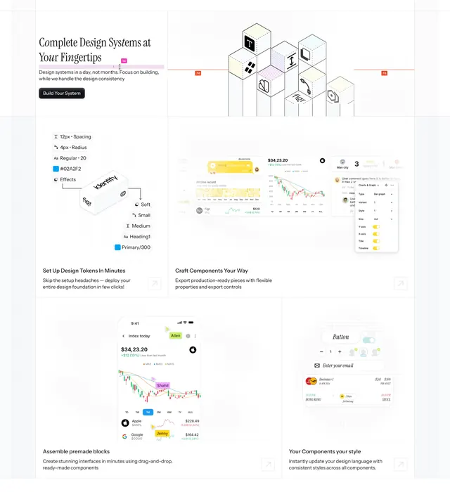
A light bento features grid for a design-system product where each cell pairs a short serif heading with an abstracted product visual: a token list, dashboard chart fragments, a phone screenshot, and a component card. The defining move is the muted hatched background and the recurring isometric wireframe cubes.
Visual description
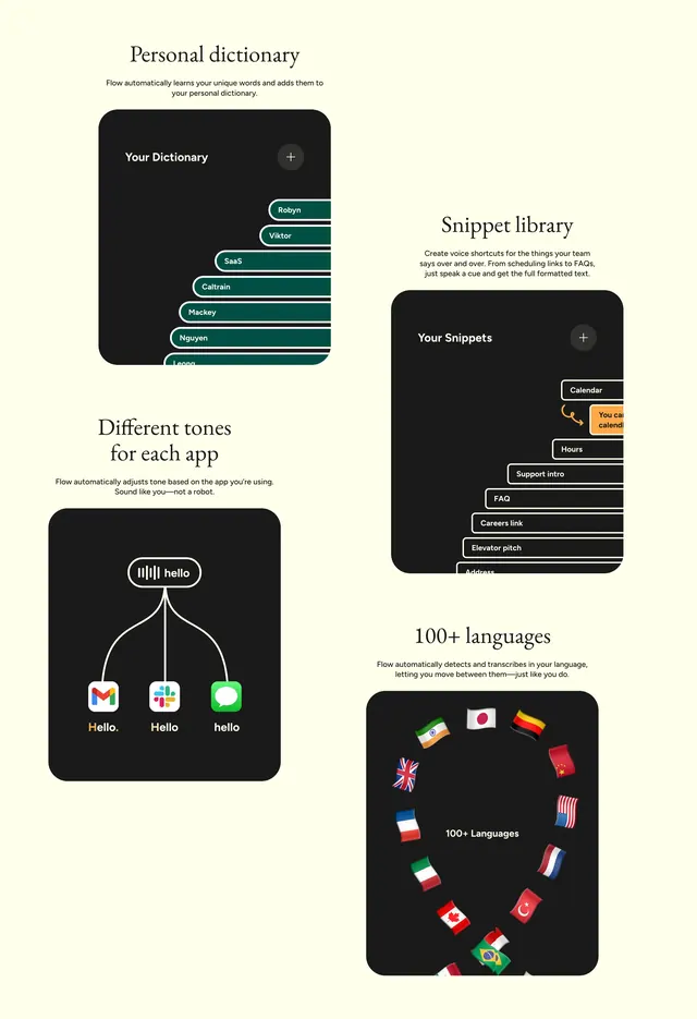
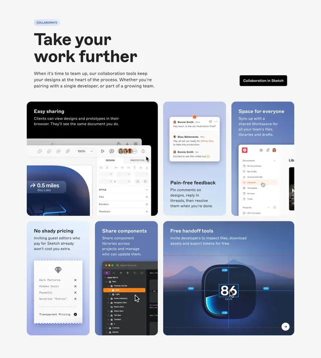
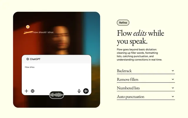
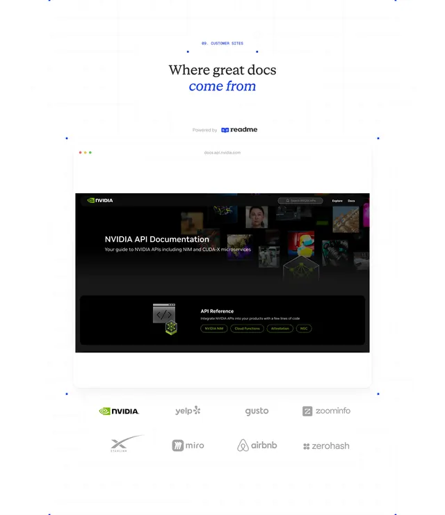
The section opens top-left with a two-line italic serif headline ("Complete Design Systems at Your Fingertips") over a line of grey sub-copy and a small black pill button. To its right, an isometric stack of outlined wireframe blocks sits over a faint hatched panel with small orange numeric markers. Below, the layout breaks into bento cells on near-white cards: a left panel listing design tokens (spacing, radius, type, color) beside a floating isometric "identity" cube; a wide cell of overlapping chart and table abstracts in soft greys with a yellow highlight; a phone mockup showing a stock/finance app; and a component card with a button, email input and pricing rows. Each lower cell carries a small serif sub-heading, a sentence of grey copy, and a thin square arrow-link in the corner.
Key takeaway
Abstracting your real UI into faint, partial fragments instead of full clean screenshots keeps a features grid calm and lets the serif copy lead. The hatched background panel plus tiny orange registration marks reads like a design-tool worktable and reinforces the product story.
Reuse notes
Strong for a design, dev-tool, or systems product that wants an editorial, non-flashy features section. The abstracted visuals need real care to look intentional rather than unfinished. Pairs with a serif-led hero in the same hatched, light palette.