Preview image. Unlock full-res
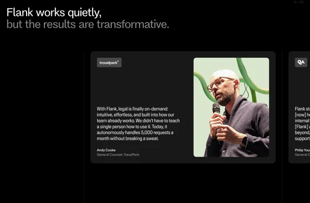
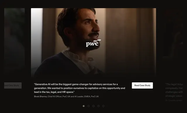
Dark testimonial carousel led by a two-tone oversized heading, with a wide quote card pairing copy and a real customer photo, and the next slide peeking off-canvas.
Summary
A dark testimonials carousel. A two-tone oversized heading sits top-left, and one wide quote card below pairs a customer quote with a full-bleed portrait photo, while the edge of the next card peeks in to signal a slider.
Visual description
Near-black background. Top-left, a two-line sans-serif heading uses color to split the message: a bright white first line ("Flank works quietly,") and a muted grey second line ("but the results are transformative."). A small "S - 03" slide counter sits top-right. Below, an offset rounded dark card holds a customer logo tag at top-left, a multi-sentence quote with a specific metric ("autonomously handles 5,000 requests a month"), and an attribution line (name, role, company). The right half of the card is a full-height portrait photograph of the person mid-speech against a soft green backdrop. The left edge of the following testimonial card is visible at the right margin, hinting at horizontal scroll.
Key takeaway
Using type color to carry emphasis: white plus grey on one heading creates a built-in pause and a quiet/loud contrast that matches the copy. Quoting a hard number inside the testimonial makes the social proof concrete. Letting the next card peek off-canvas communicates "slider" without visible arrows or dots.
Reuse notes
Best when you have strong named customers, real photography, and quotes with specific outcomes. The off-canvas peek needs an obvious affordance (drag, arrows, or autoplay) so users know it scrolls. The two-tone heading relies on a dark background for the grey line to read as intentional rather than low-contrast.
More testimonials sections
See all







More like this



Keep what you find
A free account saves references to boards and can send you a weekly email of picks based on what you save.
To see every result, go Pro.