Preview image. Unlock full-res
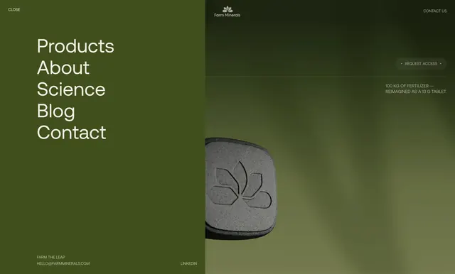
Split-screen menu overlay with oversized white nav links on dark olive green and a blurred product hero visible behind.
Summary
A full-screen nav overlay that slides a dark olive panel with stacked mega-links over a blurred hero showing logo, access CTA, and a product tablet close-up.
Visual description
Roughly 45/55 vertical split. Left panel solid dark olive green: CLOSE label top-left; large white sans links stacked center-left reading Products, About, Science, Blog, Contact; footer row with FARM THE LEAP tagline and HELLO@FARMMINERALS.COM bottom-left, LINKEDIN bottom-right, all small caps. Right side shows blurred lighter-green hero beneath: Farm Minerals flower logo and wordmark top-center, CONTACT US top-right, pill outline button REQUEST ACCESS with dot flanking mid-right, small caps line below on 100 kg fertilizer reimagined as a 13 g tablet. Lower area: sharp close-up of a dark gray rounded square tablet embossed with the flower logo, bleeding slightly into the menu panel. Soft blur on background keeps hierarchy on navigation.
Key takeaway
Keep the menu typographically loud while the page behind stays legible but out of focus, so users never lose site context. Product macro peeking under the drawer reinforces brand during navigation.
Reuse notes
Premium editorial sites with few top-level destinations. Contrast and large type carry wayfinding; not suited to deep multi-level menus. Blur-plus-product peek needs a strong hero asset to avoid feeling empty.
More navbar sections
See all











More like this



Keep what you find
A free account saves references to boards and can send you a weekly email of picks based on what you save.
To see every result, go Pro.