Preview image. Unlock full-res
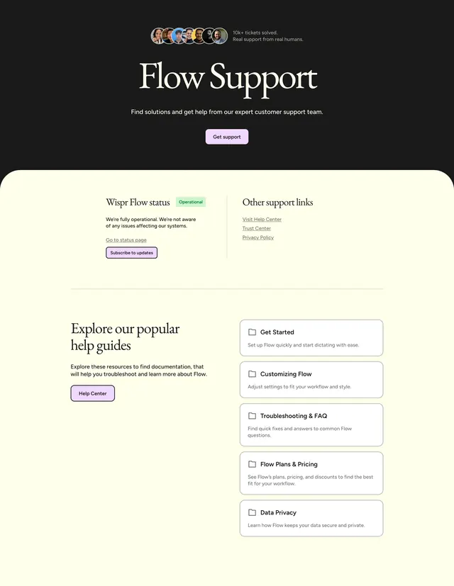
Support hub with a dark hero, avatar social proof, lavender CTAs, and a cream content panel covering status, links, and stacked help guide cards.
Summary
A support landing page opening with a dark hero and overlapping avatar proof, then a cream panel with rounded top corners housing status, quick links, and a two-column help guide list.
Visual description
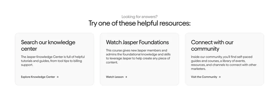
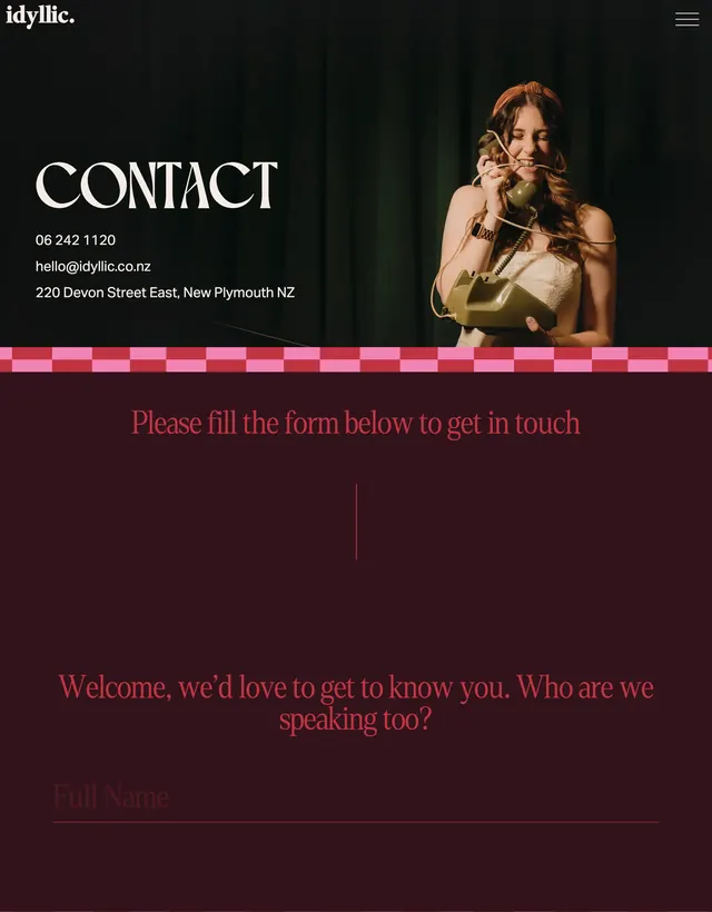
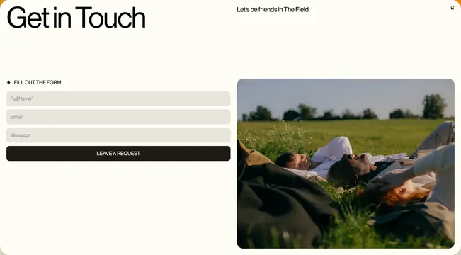
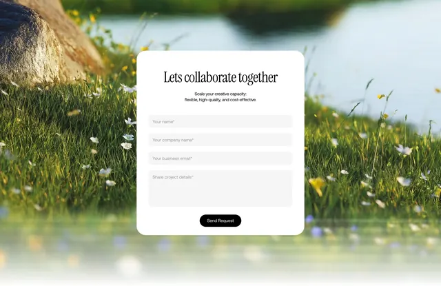
Top band is solid charcoal. Centered row of seven overlapping circular avatars sits above small white text reading 10k+ tickets solved. Real support from real humans. Large white serif headline Flow Support follows with sans-serif subcopy about expert help and a centered lavender Get support button with dark text. Below, a wide cream container with large top-left and top-right radius overlaps the dark hero. Its upper half splits into two columns divided by a thin vertical rule: left shows Wispr Flow status with a green Operational pill, operational copy, underlined Go to status page link, and a bordered Subscribe to updates button; right lists Other support links as underlined entries for Help Center, Trust Center, and Privacy Policy. A horizontal rule separates a lower two-column block: left introduces Explore our popular help guides in large serif with descriptive copy and a Help Center button; right stacks five white rounded cards with thin borders, each with a folder icon, bold title, and short description covering Get Started, Customizing Flow, Troubleshooting and FAQ, Flow Plans and Pricing, and Data Privacy.
Key takeaway
Dark hero plus cream card panel with rounded top corners creates a clear support destination without a generic form. Avatar overlap and ticket count humanize the team before any links. Status and quick links above guide cards answer urgent needs first, then self-serve depth.
Reuse notes
Template for SaaS support or contact hubs prioritizing docs over tickets. Lavender accent buttons tie to Flow brand; adjust for contrast on cream. Card list scales well; more than six entries may need pagination or categories.