Preview image. Unlock full-res
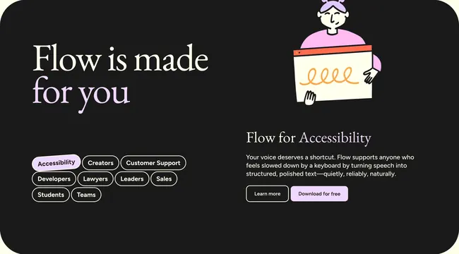
Dark rounded feature panel with a persona tag grid on the left and a dynamic detail column on the right, here showing the Accessibility segment with illustration and dual CTAs.
Summary
A dark, rounded two-column feature block where selectable persona pills on the left swap the right-hand story, here highlighting Accessibility with a hand-drawn illustration and paired CTAs.
Visual description
Charcoal near-black container with generous corner radius. Left column leads with a large serif headline "Flow is made for you" where "for you" is lavender while the rest is off-white. Below, a grid of pill tags lists Creators, Customer Support, Developers, Lawyers, Leaders, Sales, Students, Teams, and Accessibility; the active Accessibility pill fills lavender with dark text while inactive pills stay outlined white on black. Right column shows a stylized illustration of a person with purple hair holding a white board with an orange squiggle line. Beneath it, "Flow for Accessibility" repeats the lavender accent on the segment name. A short sans-serif paragraph explains voice as a keyboard shortcut for polished text. Two buttons sit below: an outlined Learn more and a solid lavender Download for free.
Key takeaway
Persona pills as lightweight navigation keep one section reusable across many landing pages without rebuilding layout. Lavender accent on only the active state and key words creates hierarchy on a dark canvas. Pairing editorial serif headings with a playful illustration humanizes an accessibility message.
Reuse notes
Strong for products with distinct user verticals such as voice tools, dev platforms, or HR software. Requires unique copy and art per segment; generic pills without tailored panels feel hollow. Dark inset panel works best on a lighter page surround.