Preview image. Unlock full-res
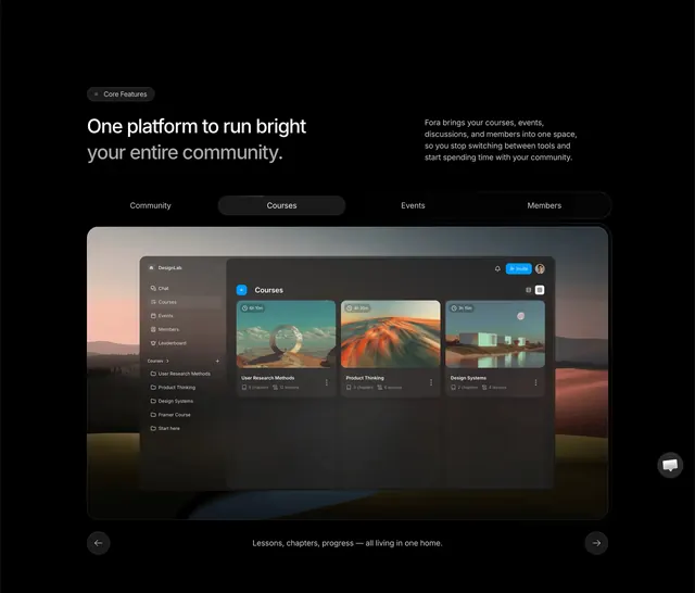
Dark tabbed feature section with a large rounded product dashboard preview over a scenic background and carousel arrows.
Summary
A black core-features section pairing oversized headline copy with horizontal tabs and a full-width product UI mockup framed over blurred hills.
Visual description
Black canvas with a top-left pill badge "Core Features." Left column carries a large white headline; right column holds muted gray body copy about unifying courses, events, and members. Below, a horizontal tab bar shows Community, Courses, Events, and Members with Courses selected on a dark rounded pill. The centerpiece is a large rounded window floating over a soft sunset landscape photo. Inside, a dark sidebar lists DesignLab navigation and a course list; the main pane shows a Courses grid with three cinematic thumbnail cards, durations, chapter counts, and titles like User Research Methods. A caption below reads "Lessons, chapters, progress all living in one home." Circular left and right arrow buttons sit at the bottom corners for carousel navigation.
Key takeaway
Tabs above one hero screenshot let a single frame stand in for four product areas without clutter. The scenic photo bleed behind the UI window adds warmth to an otherwise flat dark layout.
Reuse notes
SaaS or community tools that need one visual to sell multiple modules. Requires a polished in-app screenshot; weak UI undermines the effect. Carousel arrows imply motion but work as static tab states too.
More product showcase sections
See all





More like this









Keep what you find
A free account saves references to boards and can send you a weekly email of picks based on what you save.
To see every result, go Pro.