Preview image. Unlock full-res
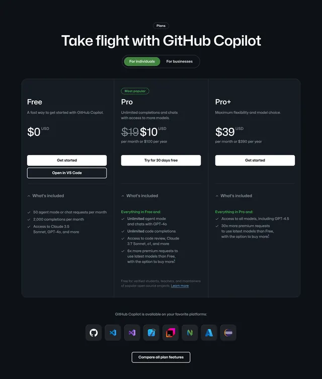
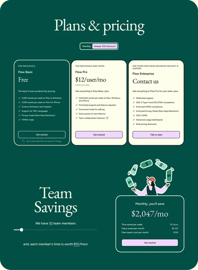
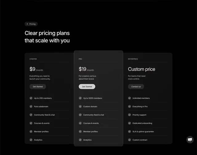
Dark three-column pricing table with a taller highlighted Pro tier, checkmark feature lists, and a floating chat widget.
Summary
A black pricing section with a badge headline and three bordered tier cards where the middle Pro plan is taller with an inverted CTA button.
Visual description
Black background with a small pill badge "Pricing" and large white headline "Clear pricing plans that scale with you." Three dark gray cards with thin borders sit in a row. Left Starter card shows $9/month, gray description, dark "Get Started" button, and six checkmarked features ending at Analytics. Center Pro card is taller and slightly lighter, priced at $19/month with a bright off-white "Get Started" button drawing focus. Right Enterprise card shows "Custom price," a "Contact us" button, and six enterprise features including SLA and custom contract. All tier names appear in small uppercase gray labels. A circular white chat bubble button floats at the bottom right.
Key takeaway
Making only the recommended tier taller plus a light-filled CTA creates hierarchy without loud color accents. Identical checkmark lists across tiers make comparison fast on a dark canvas.
Reuse notes
Community or creator SaaS with a clear good-better-best ladder. Middle-tier emphasis suits self-serve signup flows. Dark-only treatment; invert carefully for light sites. Floating chat widget is optional chrome outside the pricing grid.