Preview image. Unlock full-res
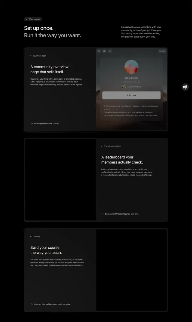
Dark stacked feature rows with alternating text-and-mockup splits inside bordered cards on black.
Summary
A black features band with a pill badge and headline, then three dark bordered rows that alternate copy and product mockups for community setup, leaderboards, and courses.
Visual description
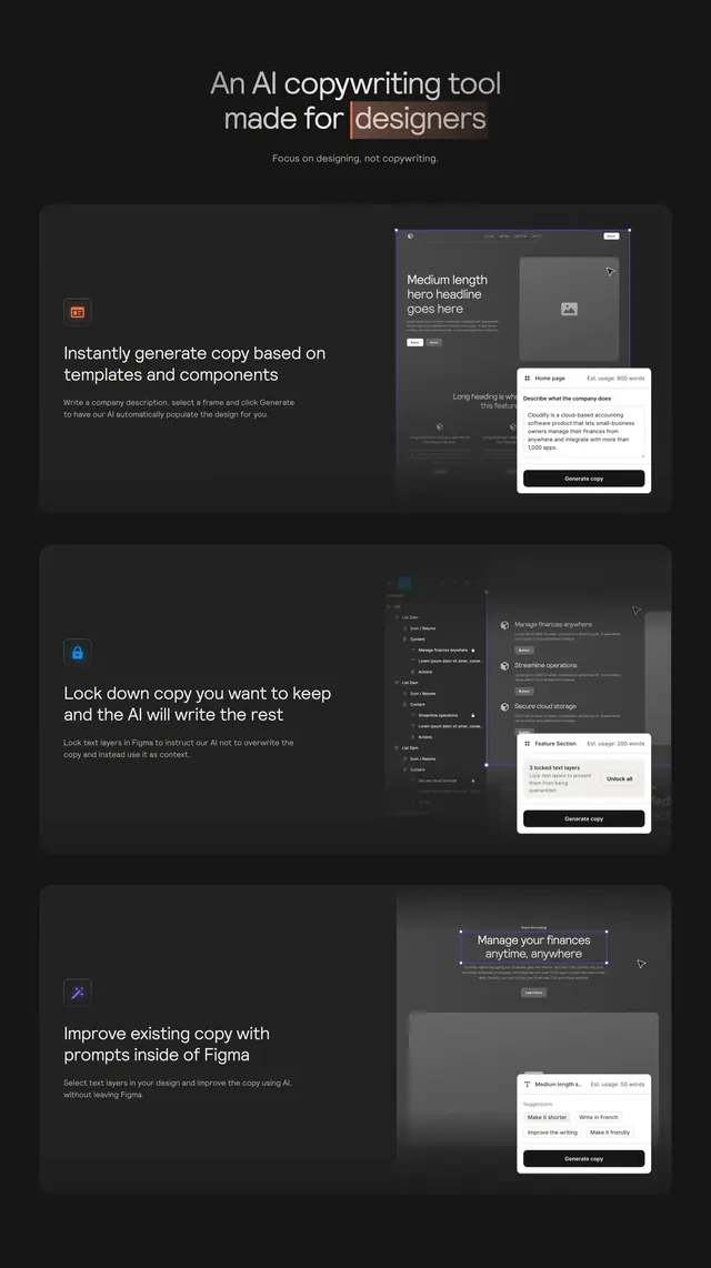
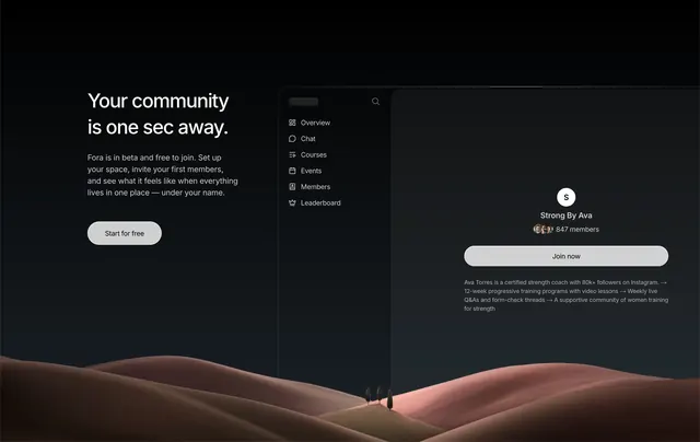
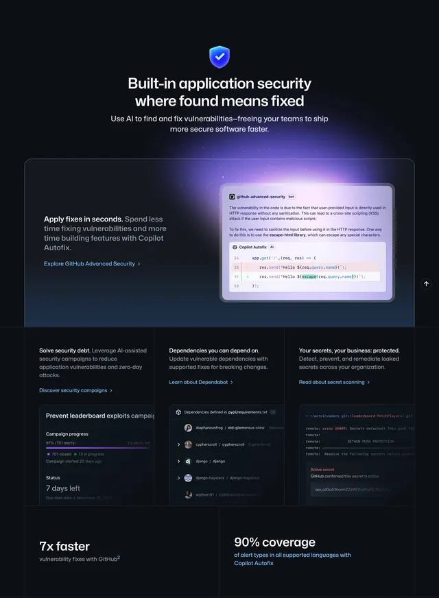
Pure black background with generous vertical spacing. Top left: small dark pill badge reading "What you get." Below, a large white headline "Set up once. Run it the way you want." sits left while muted gray supporting copy fills the right column. Three full-width dark gray cards with thin visible borders stack below. Row one splits text left and a community overview mockup right showing a DesignLab profile with gradient avatar, join button, and benefit list. Row two reverses: a black placeholder panel left and leaderboard copy right. Row three returns to text left with course-builder copy and a black placeholder right. Each text block uses a small dot label, bold subhead, gray body, and a sparkle icon footer line.
Key takeaway
Alternating split rows inside uniform bordered cards keep long feature lists scannable without a rigid grid. Dot labels plus sparkle footers give each block a name and payoff without adding chrome.
Reuse notes
Community or course platforms explaining setup, engagement, and content in one scroll. Works on dark only; needs real product screenshots in the visual slots. Pair with a tabbed product showcase above or pricing below.