Preview image. Unlock full-res
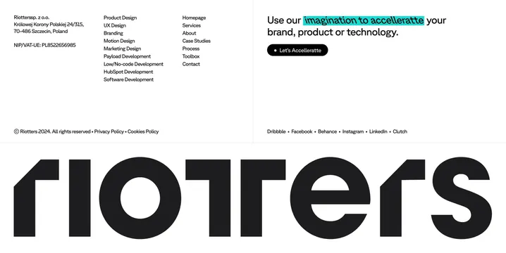
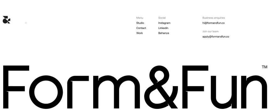
Minimal white footer with link columns, contact emails, and a giant Form&Fun wordmark spanning the full width.
Summary
A spacious footer that organizes menu, social, and contact details above an enormous Form&Fun logotype.
Visual description
White background with wide horizontal padding. Top-left shows a small black geometric logo mark built from circle, square, and ampersand shapes. Upper-right splits into three columns: Menu (Studio, Contact, Work), Social (Instagram, Linkedin, Behance), and Contact with gray sub-labels for Business enquiries (hi@formandfun.co) and Join our team (apply@formandfun.co). Column headers sit in light gray caps; links and emails are bold black sans-serif. The lower half is dominated by an oversized black "Form&Fun" wordmark nearly edge to edge, with a small TM superscript on the final n.
Key takeaway
Utility links stay compact up top so the giant wordmark can own the bottom without competing for attention. Pairing two purpose-specific email lines beats a single generic contact address.
Reuse notes
Best for creative studios with a strong typographic identity. The oversized wordmark needs ample bottom padding and will crop awkwardly on narrow viewports. Light monochrome only unless the whole footer inverts together.