Preview image. Unlock full-res
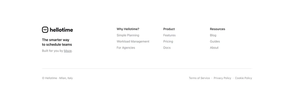
Spare white footer with a logo-and-tagline block on the left and three tidy link columns, divided from a thin legal row.
Summary
A minimal, mostly-white footer: a left brand column with the hellotime logo and a short tagline, three link columns to its right, and a thin rule above a compact legal line.
Visual description
On a plain white field, the far-left column shows the hellotime wordmark with its rounded smile-face icon, a two-line near-black tagline "The smarter way to schedule teams," and a small gray credit "Built for you by Moze" (Moze underlined). Three link columns follow, each with a bold near-black header over muted gray links: "Why Hellotime?" (Simple Planning, Workload Management, For Agencies), "Product" (Features, Pricing, Docs), and "Resources" (Blog, Guides, About). A faint horizontal rule spans the full width below, separating a bottom row: left, "Hellotime - Milan, Italy"; right, "Terms of Service - Privacy Policy - Cookie Policy" in gray.
Key takeaway
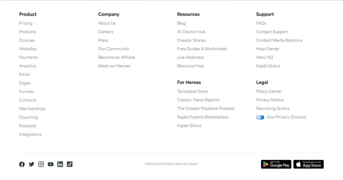
The clean four-column rhythm with a brand-plus-tagline anchor column and bold headers over muted links for instant scannability. Pushing the legal links and copyright below a single thin divider keeps the main area airy. The small "Built by" credit line is a tasteful way to attribute the maker.
Reuse notes
A reliable default footer for almost any light SaaS or productivity site that wants restraint. Scales to more columns easily. Because it relies on whitespace and type weight alone, keep link counts short per column and the divider faint; nothing here works against a dark background without recoloring.