Preview image. Unlock full-res
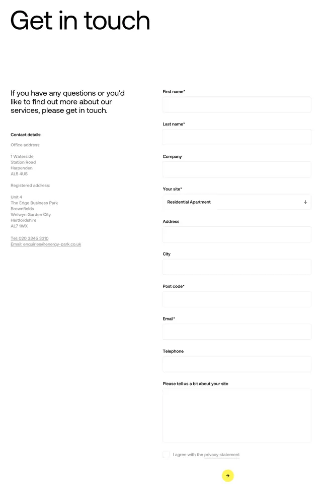
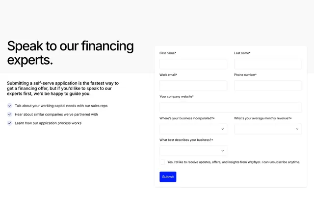
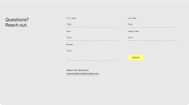
Light gray contact block with a two-line headline on the left and a dotted-underline form plus yellow pill submit on the right.
Summary
A restrained contact section that leads with "Questions? Reach out." and routes users through a sparse dotted-line form or a direct email link.
Visual description
Soft light gray background. Left column shows a large bold sans-serif headline stacked as "Questions?" and "Reach out." The right area is a form grid: monospace field labels ("First Name," "Last Name," "Email," "Company Name," "Message") each with a "Type" placeholder and a dotted horizontal rule as the input underline. First row is two columns; second row is two columns; message spans wider on the left. A bright yellow rounded pill "Submit" button sits bottom right of the form cluster. Below the message field, small copy reads "Reach out directly at" with an underlined email address "connect@foundationalloy.com." No borders, cards, or icons; spacing and typography carry the layout.
Key takeaway
Dotted underlines instead of boxed inputs keep a form feeling editorial on a gray wash. The yellow pill is the only saturated element, so the CTA reads instantly without heavy button chrome.
Reuse notes
Use for B2B contact pages that should feel calm rather than salesy. Pairs with the site's yellow accent and monospace label detail. Dotted fields need careful focus-state design; offer the direct email escape hatch for users who dislike forms.