Preview image. Unlock full-res
Light split section pairing a serif integration headline with an eight-logo card grid of back-office platform marks.
Summary
Light split band with a serif integration claim on the left and an eight-cell grid of white logo cards for back-office platforms on the right.
Visual description
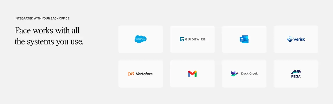
Warm off-white background with a roughly one-third / two-thirds split. Left column carries a small all-caps eyebrow ("INTEGRATED WITH YOUR BACK OFFICE") and a two-line serif headline about working with existing systems. Right side shows a four-by-two grid of equal white rounded cards, each centering a full-color enterprise logo (Salesforce, Guidewire, Outlook, Verisk, Vertafore, Gmail, Duck Creek, Pega). Cards sit on the light ground with subtle separation and even gutters; no section border or heavy chrome.
Key takeaway
Putting recognizable integration logos inside uniform white tiles keeps a long partner list orderly without a flat marquee strip. The serif headline on the left gives editorial weight while the grid does the proof work on the right.
Reuse notes
Strong for B2B or ops products that plug into an existing stack, especially when logos need full color to read. Needs enough horizontal space for the grid; on mobile stack headline above and collapse to two columns. Works best when partner marks are well known.