Preview image. Unlock full-res
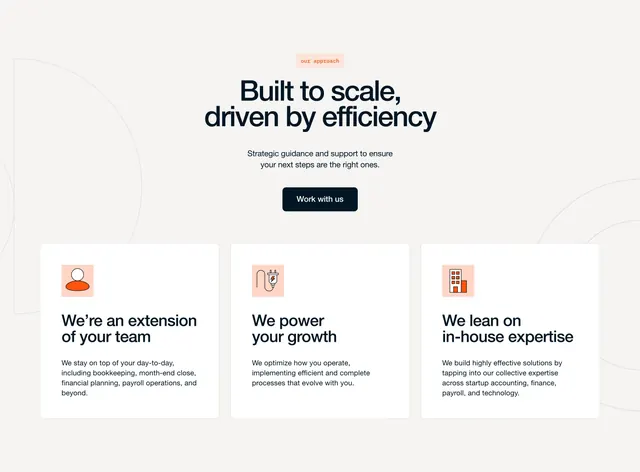
Centered approach section with serif headline, primary CTA, and three icon cards on a pale field with faint concentric circle graphics.
Summary
A value-forward features block introducing Furey's operating model through a centered headline and three equal cards describing team extension, growth enablement, and in-house expertise.
Visual description
Warm off-white background with large faint gray concentric circle line art behind the content. Centered top stack: peach pill badge "our approach," large navy serif headline "Built to scale, driven by efficiency," gray subcopy on strategic guidance, and a filled navy "Work with us" button. Below, three identical white rounded cards in a row. Each card has a small peach square icon tile with a red-orange pictogram (person silhouette, power plug with bolt, office building), a bold navy title, and gray body copy. Titles read "We're an extension of your team," "We power your growth," and "We lean on in-house expertise," with short paragraphs on bookkeeping, process optimization, and cross-functional expertise.
Key takeaway
Serif headline over sans body plus peach micro-icons gives a consultancy feel without stock photography. Faint background circles add depth while keeping the three cards as the focal plane.
Reuse notes
Good for B2B services explaining how they work before a deeper process section. The three-card grid is conventional; differentiation comes from the serif headline and restrained palette. Pair with a tabbed or timeline section if the approach needs more than three bullets.