Preview image. Unlock full-res
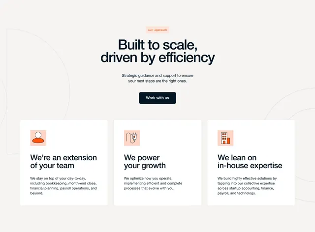
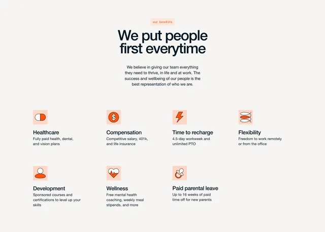
Centered careers benefits section with a people-first headline and a seven-card icon grid on a warm off-white field.
Summary
A warm, people-first benefits block for a careers page: pill label, oversized headline, supporting copy, then seven perk cards with line-art icons on peach squares.
Visual description
Off-white background with generous vertical padding. A small peach pill badge reads "our benefits" above a large centered navy headline, "We put people first everytime," followed by a short centered paragraph in muted gray. Below, seven benefit items sit in a loose grid (four across the top row, three centered on the bottom). Each card pairs a square peach icon tile with a simple black line illustration accented in orange (pill, dollar sign, lightning bolt, spring coil, person silhouette, heart with pulse line, pacifier) beside a bold benefit title and one-line description in dark navy and gray sans-serif.
Key takeaway
The icon-tile system: one soft peach square, one minimal line icon with a single orange accent, and a tight title-plus-one-liner hierarchy. The centered headline stack with a pill category label gives HR content a polished marketing feel without imagery.
Reuse notes
Strong template for startup or agency career pages that need to sell culture through perks, not photos. Works best with six to eight evenly weighted benefits. The pastel orange accent needs a consistent icon set to stay cohesive.