Preview image. Unlock full-res
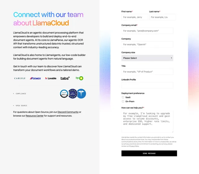
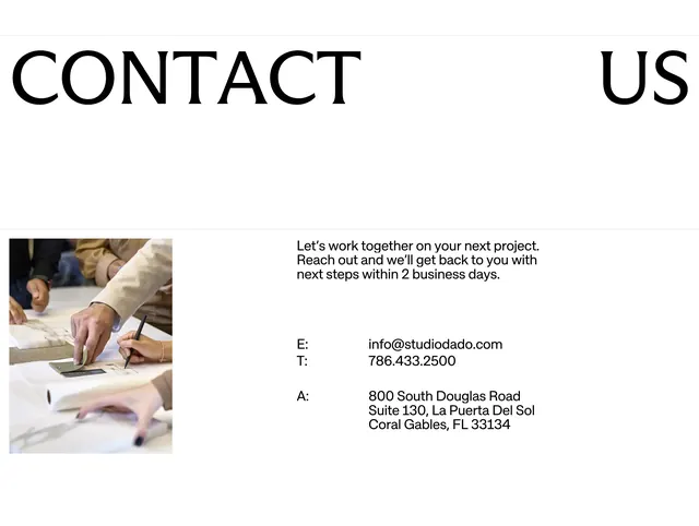
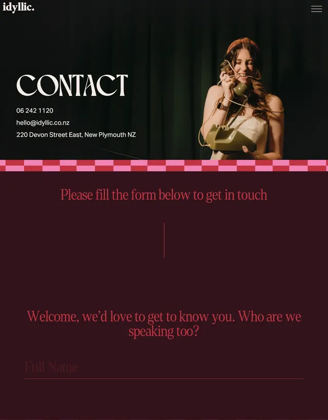
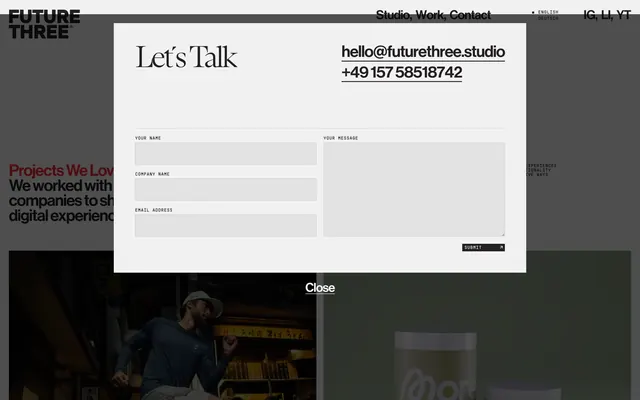
Light gray contact modal overlay with serif headline, inline contact links, and a two-column inquiry form on a dimmed page backdrop.
Summary
A full-width "Let's Talk" contact modal with serif headline, underlined email and phone links, and a split form layout over a dimmed studio page.
Visual description
Light gray modal card centered over a darkened site background. Header row: large black serif "Let's Talk" left; underlined bold sans contact links hello@futurethree.studio and +49 157 58518742 right, separated by a thin rule. Form in two columns: left stack of three labeled fields YOUR NAME, COMPANY NAME, EMAIL ADDRESS in small monospaced caps above flat gray input rectangles; right tall YOUR MESSAGE textarea spanning the full height. Bottom right: compact black SUBMIT button with white monospaced label and diagonal arrow. Site header visible behind modal with FUTURE THREE logo, Studio Work Contact nav, language toggle, and social links. Centered underlined Close control sits below the modal over dark footer imagery.
Key takeaway
Mixing a high-contrast serif headline with monospaced form labels gives a contact form editorial personality without sacrificing clarity. Placing direct contact links beside the headline lets urgent inquiries bypass the form. The two-column form with a full-height message field balances scannability and room for detail.
Reuse notes
Works for agency or studio sites where contact is a modal rather than a dedicated page. Light modal on dimmed backdrop needs sufficient contrast on the underlying page. Monospaced labels pair well with minimal gray fields but may feel cold for consumer brands.