Preview image. Unlock full-res
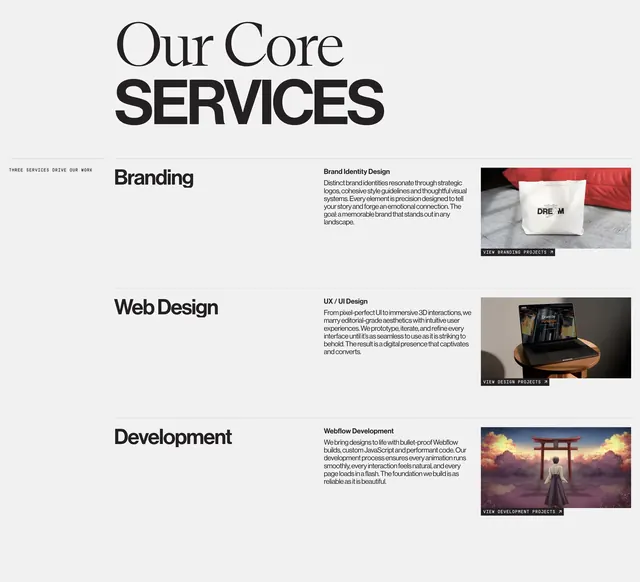
Light editorial services section with mixed-type headline and three horizontal rows for Branding, Web Design, and Development, each with copy and project imagery.
Summary
A three-row services list under a mixed serif-and-sans headline, with each offering split into category label, descriptive copy, and a project image with a compact CTA button.
Visual description
Warm off-white background. Top left: small caps sidebar "THREE SERVICES DRIVE OUR WORK." Main headline "Our Core SERVICES" with "Our Core" in serif and "SERVICES" in heavy sans caps. Three horizontal rows separated by thin gray rules. Row one Branding: bold left label, middle subhead Brand Identity Design with paragraph on logos and style guidelines, right photo of white tote bag reading DREAM beside a red pillow, black pill button VIEW BRANDING PROJECTS with arrow. Row two Web Design: UX / UI Design copy on editorial aesthetics and prototyping, right MacBook on stool showing a Driven by Perfection site, VIEW DESIGN PROJECTS button. Row three Development: Webflow Development copy on performant builds, right anime illustration of figure approaching a red torii gate at sunset, VIEW DEVELOPMENT PROJECTS button.
Key takeaway
The three-column row pattern scales service depth without cards or icons: category, narrative, proof image. Mixing serif and sans in one headline signals editorial craft while staying readable. Small black CTA pills with arrow keep each row actionable without dominating the layout.
Reuse notes
Strong template for agency services or capabilities pages. Row layout needs wide desktop; stacks to single column on mobile. Photography and illustration quality per row carry equal weight; weak assets break the editorial tone.