Centered product suite intro with a gradient product name, single CTA, and a row of seven colorful product icon tiles in a rounded container.
Summary
A minimal white product showcase introducing the G-P Meridian Suite with a gradient-highlighted product name, one explore CTA, and seven distinct product icons in a shared rounded tray.
Visual description
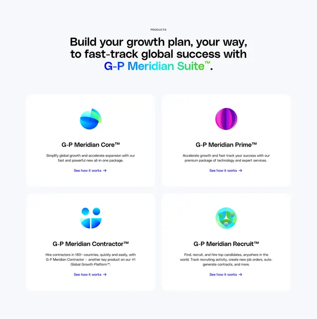
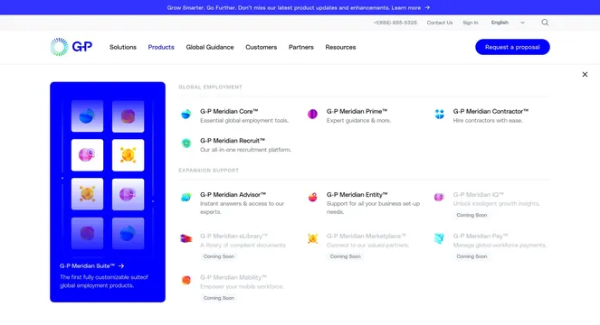
White section with centered hierarchy. Small gray all-caps "OUR PRODUCTS" label at top. Large black headline "Accelerate your growth with G-P Meridian Suite" where the product name carries a blue-to-green gradient. Short gray paragraph below claims the suite is the industry's first fully customizable global employment product set. Centered blue pill button "Explore our products" with white arrow. At bottom, a wide white rounded rectangle with soft shadow holding seven evenly spaced product tiles. Each tile is a colorful abstract sphere or geometric icon with a small gray label underneath: Prime, Core, Contractor, Recruit, Advisor, Entity, and IQ. Icons use distinct palettes: purple-magenta stripes, blue-teal bands, stacked blue semicircles, green geometric person shape, blue-green globe mesh, orange sphere with location pin, and purple sphere with magnifying glass.
Key takeaway
Naming the suite inside the headline with a gradient treatment makes the product line feel like a branded entity, not a bullet list. Seven icons in one tray communicate breadth without individual cards or copy blocks. Keeping the section to one CTA avoids decision fatigue when the goal is exploration, not conversion on a specific SKU.
Reuse notes
Strong for multi-product B2B platforms where each offering needs a visual identity but not a full feature write-up. Requires a consistent icon system with varied but harmonious color. Works on light pages with generous vertical padding. Seven items may need horizontal scroll or fewer tiles on mobile.