Preview image. Unlock full-res
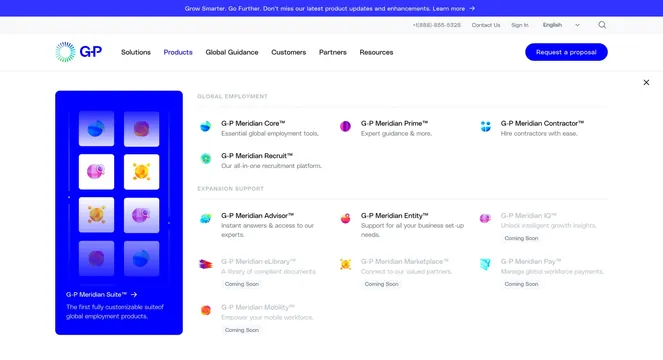
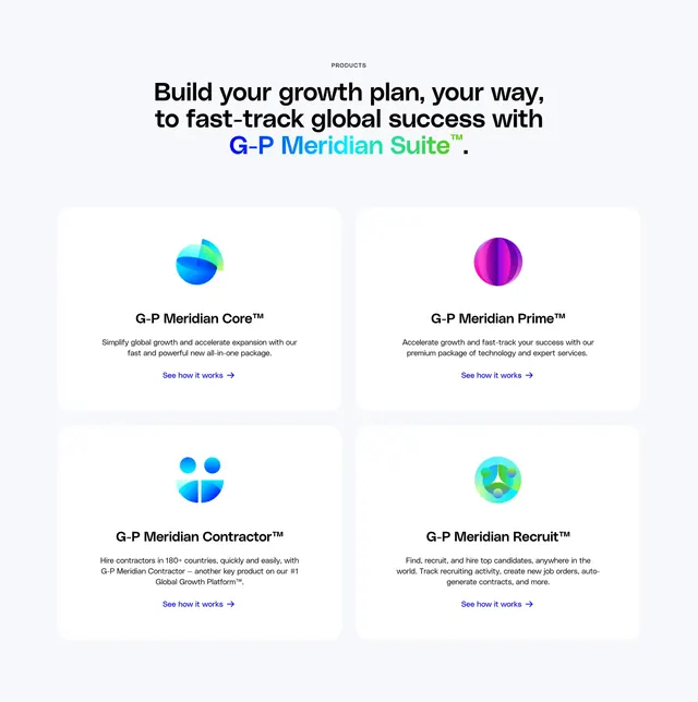
Light gray products section with gradient-accent headline and a 2x2 grid of white cards for four G-P Meridian Suite offerings.
Summary
A centered products band on a pale gray field, pairing a gradient-highlighted suite headline with four equal white cards for Core, Prime, Contractor, and Recruit.
Visual description
Small uppercase "PRODUCTS" label sits above a large centered headline. The phrase "G-P Meridian Suite" uses a blue-to-green horizontal gradient while the rest of the line stays black. Below, four white rounded cards form a 2x2 grid with generous gutters. Each card leads with a colorful abstract vector icon (blue layered sphere for Core, purple segmented sphere for Prime, blue figure motif for Contractor, green network circle for Recruit), then a bold product name with trademark, a short gray description, and a blue "See how it works" text link with arrow. Cards share equal padding, corner radius, and no visible borders beyond soft shadow on the page background.
Key takeaway
Using one gradient phrase inside an otherwise plain headline to anchor a multi-product grid without heavy brand chrome. The abstract icon family keeps four distinct SKUs visually unified at card scale.
Reuse notes
Strong pattern for SaaS suite pages where each tier needs equal weight. Works on light backgrounds with a restrained palette plus one gradient accent. Needs concise one-line descriptions per card; long copy will break the grid rhythm on smaller breakpoints.