Preview image. Unlock full-res
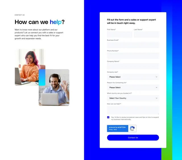
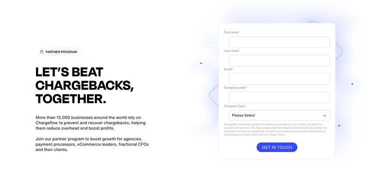
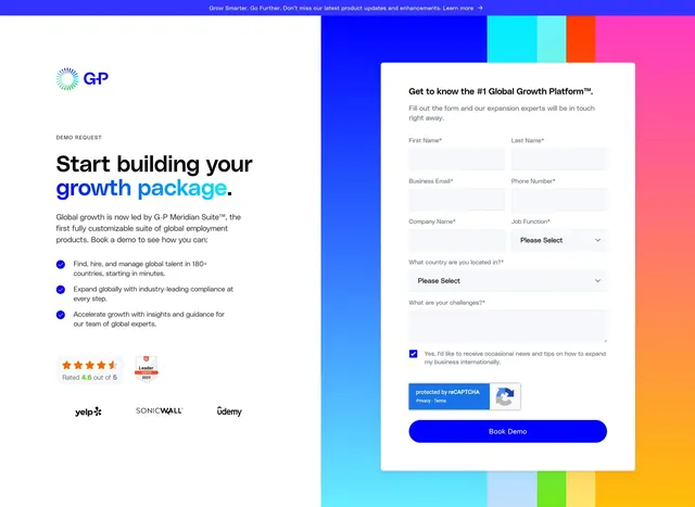
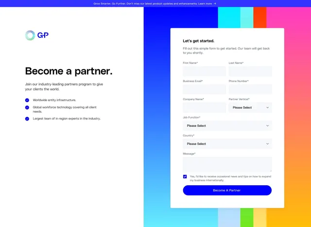
Split partner signup section with benefit copy and checkmark list on white, and a lead form on a multicolor vertical stripe background.
Summary
A two-column partner application section pairing persuasive left-rail copy with a detailed lead form floating on a bold multicolor stripe panel.
Visual description
Top edge shows a thin blue announcement bar. Left half is white with the G-P circular logo mark, a large bold headline "Become a partner.", subcopy, and three benefit lines each prefixed by a blue checkmark icon in a circle. Right half is a full-height panel of vertical color stripes (blue, cyan, orange, pink, yellow, green). A white rounded card sits centered on the stripes holding a multi-field form: paired first/last name, email, phone, company, three dropdowns, a message textarea, a checked marketing consent checkbox, and a full-width bright blue pill CTA labeled "Become A Partner". Required fields marked with asterisks.
Key takeaway
The striped color panel as a low-effort way to brand a form without illustration. Keeping the form in a floating white card preserves readability while the left column stays calm and copy-focused.
Reuse notes
Good reference for B2B partner or sales pages where the form is long but the layout still feels approachable. The stripe treatment needs a strong brand palette; on narrow viewports the split will stack. Form density is high, so pair with strong headline and three concise proof points on the left.