Preview image. Unlock full-res
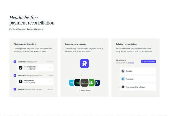
Three-column feature section with a serif headline and cards showing payment tracking timelines, accounting integrations, and reconciliation status UI.
Summary
Three-column feature section with a serif headline and cards showing payment tracking timelines, accounting integrations, and reconciliation status UI.
Visual description
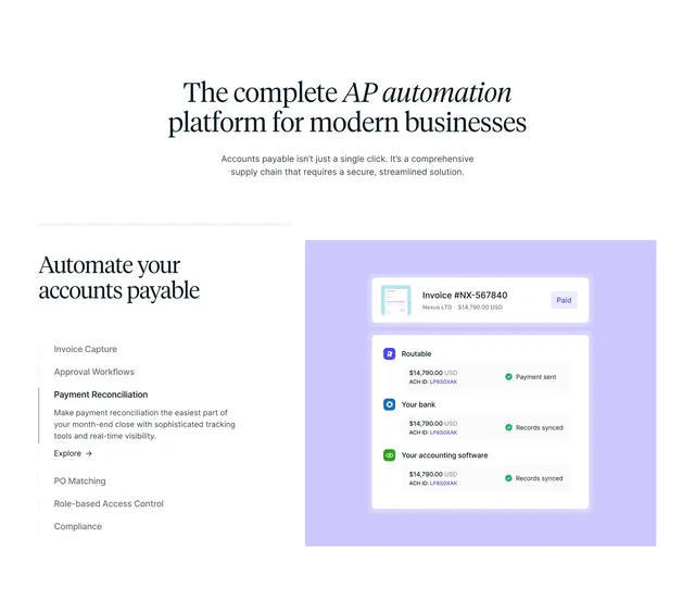
Off-white background with a large centered serif headline "Headache-free payment reconciliation" and a text "Explore Payment Reconciliation" arrow link beneath. Three equal light-gray rounded cards sit in a row. The left card, "Clear payment tracking," shows a vertical activity timeline with nested white status cards, amounts, and icons for payment sent, record added, and bank transfer initiated. The center card, "Accurate data, always," centers a blue Routable logo with thin lines radiating to Xero, Sage, NetSuite, QuickBooks, and Dynamics icons, plus a pill reading "Always in sync." The right card, "Reliable reconciliation," shows a bill payment row with an ACH ID, a blue "Records synced" status pill, and a bracketed stack linking Routable, your bank, and accounting software.
Key takeaway
Each feature card pairs a short headline and one-line benefit with a bespoke mini UI illustration instead of generic icons, so abstract reconciliation concepts read instantly. The center integration hub diagram with recognizable accounting logos makes the sync story concrete. Nested timeline cards inside the activity feed add depth without leaving the card frame.
Reuse notes
Strong for fintech or payments SaaS explaining multi-step workflows in a scannable three-up grid. Needs crisp product UI mockups and real integration logos to feel credible. The serif headline adds editorial weight; keep card illustrations consistent in scale and corner radius.