Preview image. Unlock full-res
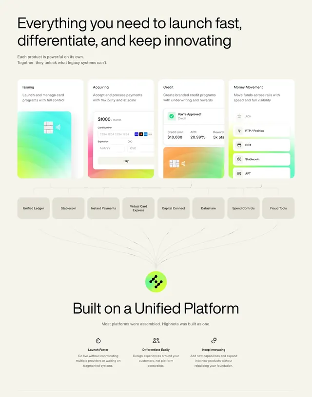
Stacked platform explainer linking four product cards through capability pills to a central hub icon and three launch value columns below.
Summary
Platform architecture story showing Issuing, Acquiring, Credit, and Money Movement cards feeding a unified hub, then three outcomes: launch faster, differentiate, keep innovating.
Visual description
Cream page opens with large headline about launching fast and gray subline on combined product power. Four tall white product cards show gradient UI vignettes for cards, checkout form, credit approval screen, and payment-rail list. Thin gray lines descend into a row of gray capability pills including Unified Ledger, Stablecoin, Instant Payments, Virtual Card Express, Capital Connect, Datashare, Spend Controls, and Fraud Tools, converging on a green-yellow circular hub icon. Bottom section headline "Built on a Unified Platform" introduces three icon columns with stopwatch, people, and sparkle icons plus explanatory copy.
Key takeaway
Lines converging to one hub visually argue "single platform" better than a bullet list. Gradient product vignettes give each module identity while shared card chrome keeps the diagram orderly.
Reuse notes
Best for complex multi-product fintech stacks. Diagram density needs wide desktop; simplify pill row on mobile.