Preview image. Unlock full-res
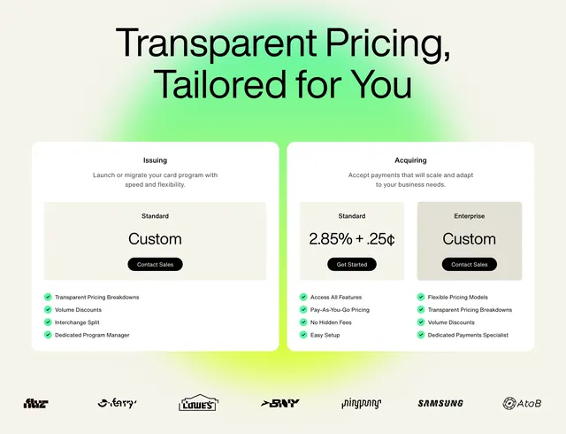
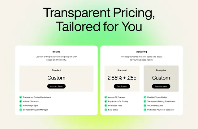
Two large pricing panels split by product line over a green radial gradient, with nested tier cards and green-check feature lists.
Summary
A pricing section that splits by product line into two big white panels over a green radial glow, each panel holding nested tier cards and a green-check feature list.
Visual description
A very large centered black headline "Transparent Pricing, Tailored for You" in heavy sans-serif sits over a soft green radial gradient that fades into cream at the edges. Two wide rounded white panels follow. The left "Issuing" panel holds one inset "Standard / Custom" tier card with a black "Contact Sales" button, then a four-item feature list with green circular checks. The right "Acquiring" panel holds two side-by-side inset tier cards, "Standard 2.85% + .25 cents" with a "Get Started" button and "Enterprise / Custom" with "Contact Sales," above two columns of green-check features. The bottom edge glows brighter green.
Key takeaway
Organizing pricing by product line into two panels, each able to nest one or several tiers, scales cleanly when offerings differ in shape. The green radial gradient gives an otherwise plain white pricing block a branded glow. Inset tier cards inside a larger panel create clear hierarchy between line, tier, and features.
Reuse notes
Use when a product sells two distinct lines with different pricing structures rather than one comparable ladder. The gradient must stay subtle so the white panels and black type keep contrast. Balance the panels carefully, since one side here holds a single tier and the other holds two.