Preview image. Unlock full-res
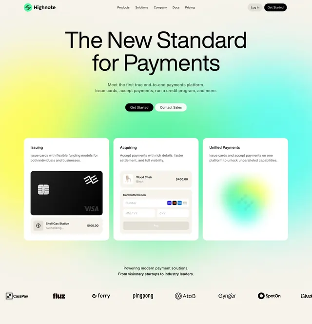
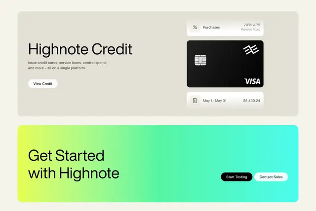
Light fintech feature pairing a product card with a black Visa card mockup, stacked above a vivid lime-to-teal gradient call-to-action.
Summary
A two-part block: a calm light product-feature card introducing Highnote Credit beside a realistic black Visa card mockup, stacked above a high-energy lime-to-teal gradient CTA. The jump from neutral feature to saturated CTA is what makes it land.
Visual description
The upper block is a soft grey rounded card. On its left, an oversized black sans headline "Highnote Credit" with two lines of muted sub-copy about issuing cards, servicing loans and controlling spend on a single platform, then a white pill "View Credit" button. On its right, a floating "Purchases / 20% APR Monthly Fixed" pill, a black Visa card mockup with the Highnote mark and an embossed chip, and below it a statement row reading "May 1 - May 31" with "$5,430.24". The lower block is a full-width panel washed in a bright lime-green to teal horizontal gradient, carrying a large black "Get Started with Highnote" headline at left and two buttons at right: a black "Start Testing" and a white "Contact Sales".
Key takeaway
Holding the feature block in muted greys and then letting the CTA explode into a saturated gradient creates a clear energy gradient down the page without changing the type system. The small APR pill and dated statement row make the card mockup feel like live product, not a static graphic.
Reuse notes
Strong for fintech, card-issuing, or payments platforms that want to look both regulated and modern. The gradient does a lot of brand work, so it needs to match the brand palette and stay readable behind black type. Reuse the muted-feature-then-bright-CTA rhythm even when the product is not a card.