Preview image. Unlock full-res
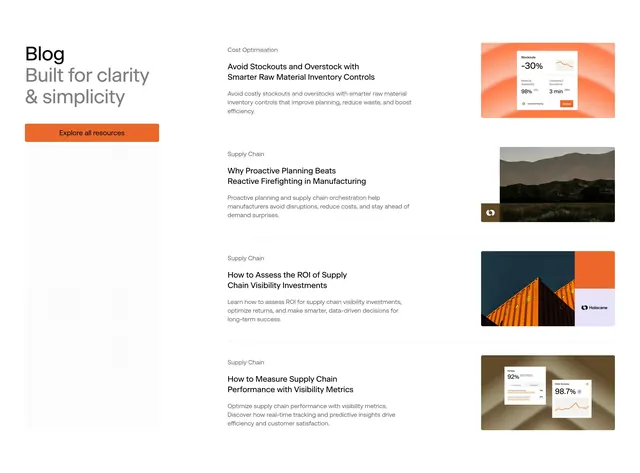
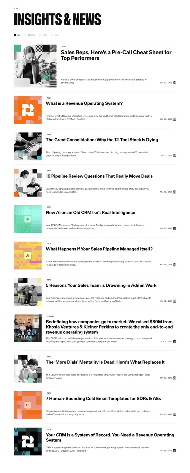
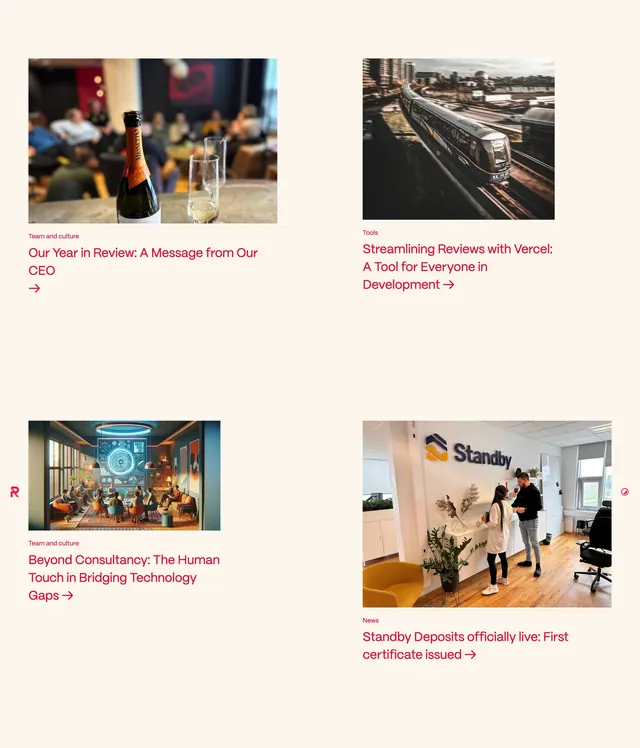
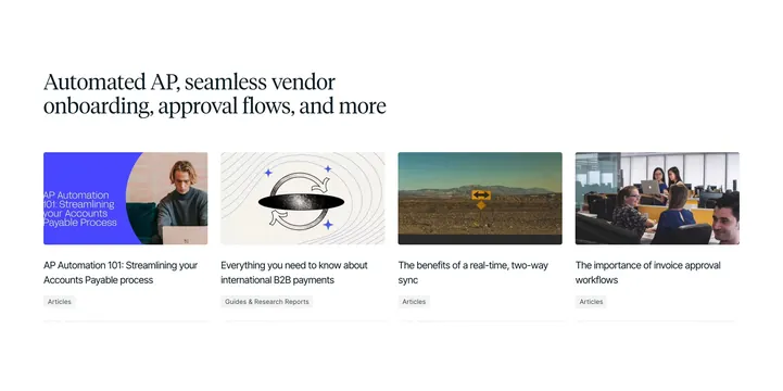
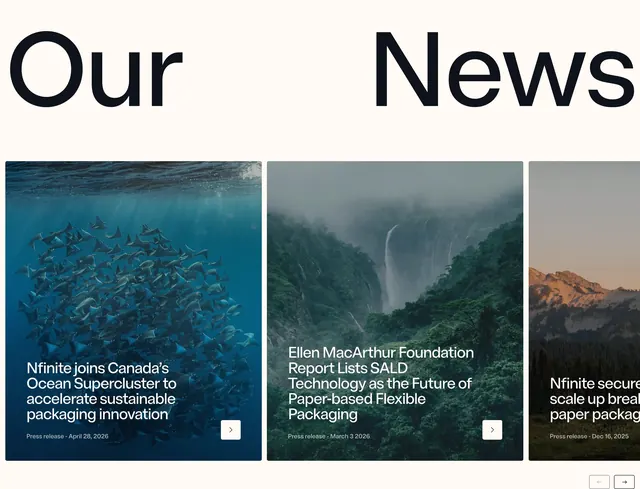
Split oversized "Our News" heading above a horizontal card slider of full-bleed nature photos with white headlines and arrow CTAs.
Summary
News section with "Our" and "News" pinned to opposite edges and a carousel of large photo cards with press-release metadata and square arrow buttons.
Visual description
Light off-white section background. Top row: massive bold black "Our" left-aligned and "News" right-aligned with wide space between. Below, three large rounded cards in a horizontal row; third card partially cropped at right edge indicating scroll. Each card uses a full-bleed nature photograph (underwater rays, misty forest waterfall, mountain golden hour) with white headline and smaller "Press release" date line at bottom left. Small white square button with black arrow sits bottom-right on each card. Pagination controls below cards: two small outlined square arrow buttons at bottom right.
Key takeaway
Split display heading creates editorial tension without extra decoration. Full-bleed photo cards with minimal text overlay keep corporate news feeling premium rather than blog-generic.
Reuse notes
Good for sustainability or science brands wanting press content to feel magazine-like. Needs strong photography per article; text-heavy releases would fight the layout.