Preview image. Unlock full-res
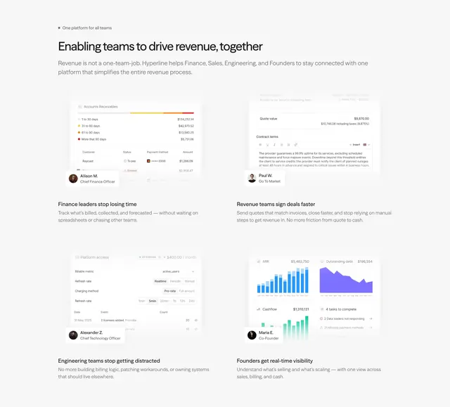
A light two-by-two feature grid where each cell pairs a real product UI mockup and a named persona card with a team-specific benefit.
Summary
A light feature section arguing "one platform for every team": a two-by-two grid where each cell shows a real product UI mockup, a named persona card, and a team-specific benefit.
Visual description
White background. A small eyebrow ("One platform for all teams") sits above a heading and a two-line subhead about connecting Finance, Sales, Engineering, and Founders. Below, a two-by-two grid: each quadrant holds a realistic product mockup (an accounts-receivable aging table, a quote with contract terms, a billing-config panel, ARR and cashflow charts), an overlaid persona card with an avatar, name, and role, then a bold benefit headline and a short description. The four personas map to the four teams named above.
Key takeaway
Mapping each feature to a named role (CFO, GTM, CTO, Founder) with a matching UI mockup, so a multi-audience product shows every buyer their own win. The persona cards add a human anchor to otherwise dense interface screenshots.
Reuse notes
Strong for horizontal platforms that serve several teams at once. It needs four distinct, legible mockups and credible role framing; vague personas weaken it. At smaller widths the dense mockups will be the first to break, so plan a stacked, simplified mobile layout.