Preview image. Unlock full-res
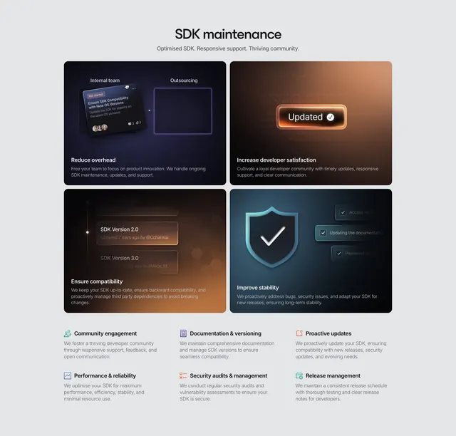
Light section pairing a 2x2 grid of dark glowing benefit cards with a six-item icon-led feature list below.
Summary
A light feature section that combines four dark, glowing benefit cards in a two-by-two grid with a tidy three-column row of icon-led feature blurbs beneath, covering both highlights and details.
Visual description
A centered "SDK maintenance" headline with a short one-line subhead sits at the top. Below, a two-by-two grid of rounded cards uses dark backgrounds with colored glows and small UI vignettes: an Internal team vs Outsourcing comparison, a glowing "Updated" badge, an SDK version list, and a checkmark shield. Each card carries a bold white sub-heading ("Reduce overhead", "Increase developer satisfaction", "Ensure compatibility", "Improve stability") and a short paragraph. Under the grid, six short features are arranged in two rows of three, each led by a small colored icon, a bold label, and two lines of muted copy on the light background.
Key takeaway
Stacking a small set of hero benefit cards over a denser icon-list of secondary features, so the section delivers both an emotional highlight reel and a thorough detail layer without feeling repetitive. Reusing the dark-card-on-light-page glow treatment to keep visual continuity with sibling sections.
Reuse notes
Good when you need to communicate four headline value props plus a longer list of capabilities in one block. The two-tier structure suits feature-rich developer or platform products. Keep the icon row visually lighter than the cards so the hierarchy stays clear.