Preview image. Unlock full-res
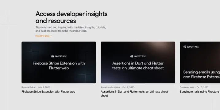
Light resources section with a left intro block and a horizontally scrolling row of dark article cards, the third peeking off-edge.
Summary
A light resources block that leads with a left-aligned intro and a "Read the Blog" link, then runs a horizontal carousel of dark article cards with the third card cut off to signal scrolling.
Visual description
On a light gray page, a two-line oversized dark headline "Access developer insights and resources" sits at the upper left over a two-line muted subhead and an orange "Read the Blog" text link with a chevron. Below, three blog cards run left to right: each is a dark rounded thumbnail with the Invertase wordmark and the article title set over a subtly glowing dark background. Beneath each card sit a gray author-and-date byline and the article title repeated in black. The third card is clipped at the right edge, indicating a horizontally scrollable slider. Faint corner line marks frame the upper-left.
Key takeaway
Deliberately clipping the third card at the frame edge to advertise that the row scrolls, without needing visible arrows. Reusing the dark blog-thumbnail style on a light page so article cards match the brand's dark product imagery.
Reuse notes
A clean pattern for surfacing latest blog or resource posts as a browsable strip. The peeking-card cue works on wide layouts; pair with arrows or dots on touch. Card thumbnails benefit from a consistent template (logo plus title) rather than freeform cover art.