Preview image. Unlock full-res
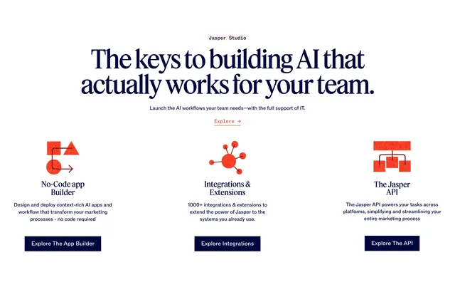
Centered Jasper Studio headline above three columns with textured red icons, serif titles, and dark primary buttons for builder, integrations, and API.
Summary
A Jasper Studio section with three equal columns for no-code app builder, integrations, and API, each with a grainy red diagram icon and dark CTA button.
Visual description
White background. Centered pink "Jasper Studio" label, large dark navy serif headline "The keys to building AI that actually works for your team.", sub-copy about IT-supported workflows, and pink "Explore ?" link. Three columns below with generous spacing. Each column: large red textured stamp-style icon (workflow shapes, hub network, API branching diagram), bold serif title (No-Code app Builder, Integrations & Extensions, The Jasper API), sans-serif description, and solid dark navy button (Explore The App Builder, Explore Integrations, Explore The API).
Key takeaway
Grainy red icons add tactile warmth to an otherwise minimal three-up feature row. Pairing text links at section level with per-column primary buttons gives both exploration paths.
Reuse notes
Works for platform pages with three core capabilities (build, connect, extend). Icons need a consistent illustrative style. Dark buttons on white columns create clear hierarchy over the pink section link.