Preview image. Unlock full-res
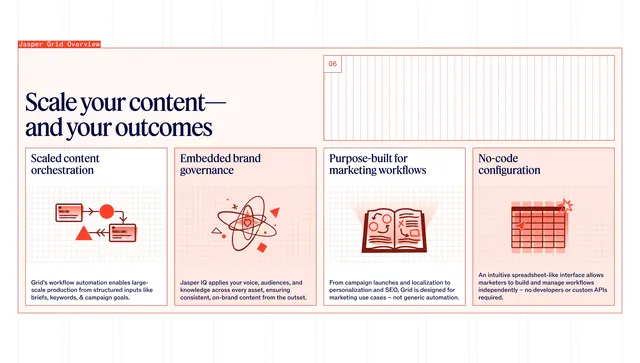
Grid-lined overview with oversized headline and four columns of red diagram icons explaining orchestration, governance, workflows, and no-code setup.
Summary
A Jasper Grid overview on a pale pink grid background with four feature columns, each pairing a red line-art diagram with a marketing workflow benefit.
Visual description
Pale pink/off-white canvas with visible thin red grid lines. Top left: red tag "Jasper Grid Overview". Top right: boxed grid pattern with "06" index. Large dark navy serif headline "Scale your content�and your outcomes". Four equal columns below, each with serif sub-head (Scaled content orchestration, Embedded brand governance, Purpose-built for marketing workflows, No-code configuration), a red-and-white minimalist diagram (workflow arrows, orbital governance rings, open book with rays, 5x5 spreadsheet grid with cursor), and sans-serif body copy describing automation, Jasper IQ, marketing use cases, and spreadsheet-like configuration.
Key takeaway
Visible grid lines reinforce a "Grid" product name literally while organizing four equal claims. Consistent red line-art icons unify disparate concepts without screenshots.
Reuse notes
Strong for spreadsheet or workflow products with four pillars. Grid background can feel busy; reduce line weight for lighter brands. Numbered slide index ("06") suggests this sits in a longer product story.