Preview image. Unlock full-res
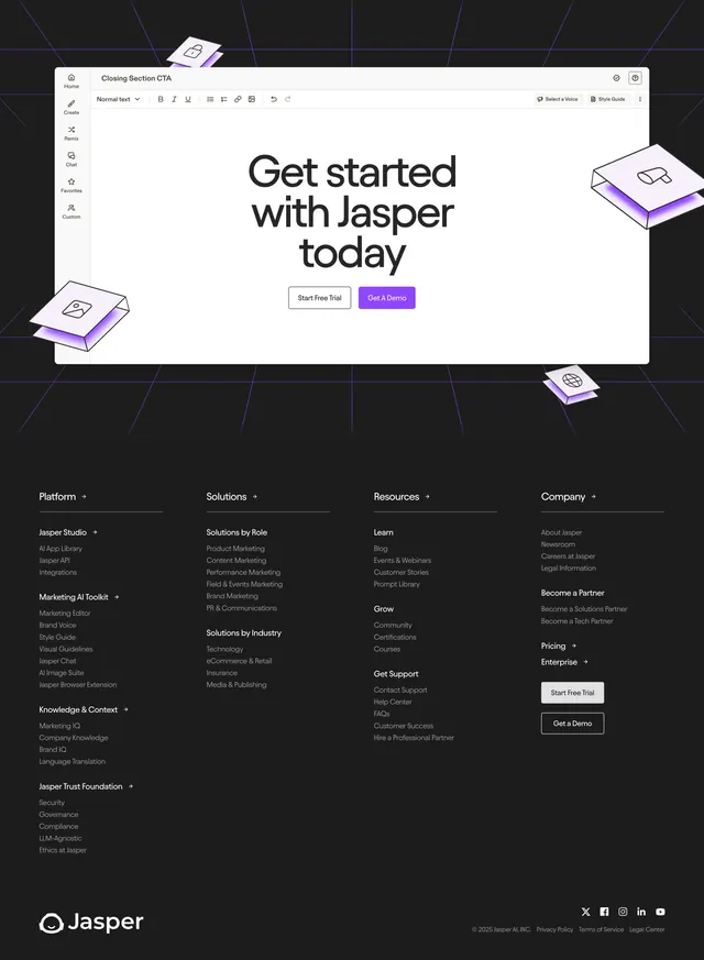
Dark four-column link footer with stacked CTA buttons and social icons, sitting directly below the same editor-window CTA block on a violet grid.
Summary
A dark, dense four-column sitemap footer that carries the editor-window CTA block at the top and ends with the Jasper logo, legal links, and social icons.
Visual description
The top third repeats the white editor-window CTA ("Get started with Jasper today" with Start Free Trial and Get A Demo buttons) and its floating isometric cards over a violet perspective grid. Below, on a flat near-black field, four link columns spread across the width: Platform (with Marketing AI Toolkit, Knowledge & Context, Jasper Trust Foundation sub-groups), Solutions (by Role and by Industry), Resources (Learn, Grow, Get Support), and Company. Each column has a bold white heading with a small arrow and muted grey link lists. A second stack of Start Free Trial and Get a Demo buttons sits under the Company column. The bottom row shows the Jasper logo and wordmark on the left, social icons (X, Facebook, Instagram, LinkedIn, YouTube) and a copyright with Privacy Policy, Terms of Service, and Legal Center links on the right.
Key takeaway
Grouping each column's links under bold sub-headings turns a long sitemap into scannable clusters. Repeating the CTA buttons both inside the editor block and again as a plain stack gives a last conversion nudge right before the legal row.
Reuse notes
Use for a content-heavy SaaS with many product, solution, and resource pages that need organizing. The four-column density needs a wide viewport. The shared editor CTA ties it to the section above, so it works best stacked directly under that block rather than standalone.