Preview image. Unlock full-res
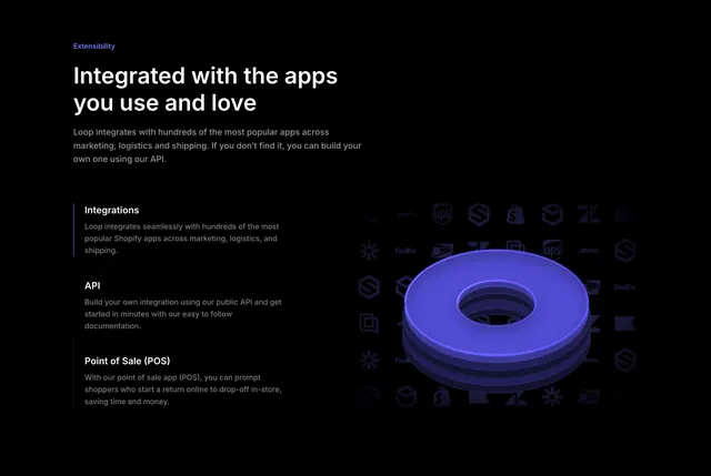
Dark split feature section with a stacked tabbed list of integration benefits on the left and a glowing blue 3D ring over a faint logo grid on the right.
Summary
A dark, two-column feature section about extensibility, with a vertical tabbed list of three integration topics on the left and a glowing blue 3D ring floating over a dim grid of partner logos on the right.
Visual description
Pure black background. Left column opens with a violet "Extensibility" eyebrow, a large two-line white headline (Integrated with the apps you use and love), and a muted intro paragraph. Below it, three stacked list items act as tabs: Integrations is active, marked by a tall violet accent bar on its left edge and brighter text, while API and Point of Sale (POS) sit below in dimmer gray, each with a bold title and two to three lines of supporting copy. The right half shows a render of a thick electric-blue ring lit from within, casting a soft glow, set against a faint scattered grid of shipping and app logos (UPS, FedEx, DHL, Shopify and others) that fade into the black.
Key takeaway
The single violet accent bar marking the active item in a quiet vertical tab list, so navigation reads without heavy chrome. The glowing 3D object floating over a dimmed, low-contrast logo grid that hints at the integration ecosystem without competing with the foreground.
Reuse notes
Strong for a developer-tool or integrations feature where you can supply one good 3D render and want a calm, premium dark layout. The faint logo grid only works on a true black field; on lighter backgrounds it would muddy. Needs real copy depth in the tab list to fill the left column.